Posts > Financial Modelling > Uncertainty in our financial model assumptions
Uncertainty in our financial model assumptions
Motivation
This is all about incorporating and appreciating the uncertainty in your model forecasts. Time and time again I see students and young professionals make overconfident valuation calls because they do not appreciate the large uncertainty in their model assumptions.
Scenario analyses, if done well, helps of course. But it is very hard to incorporate more than a few sources of uncertainty into a scenario analysis. Simulations on the other hand can incorporate many sources of uncertainty and I found them to be a nice teaching tool for visualizing how fast uncertainty can accumulate. Here is a simple example in case someone else might find it useful.
A few months ago, I heard about the Johnson Quantile-Parameterized Distribution while watching a Stan tutorial.
The Johnson Quantile-Parameterized Distribution (J-QPD) is a flexible distribution system that is parameterised by a symmetric percentile triplet of quantile values (typically the 10th-50th-90th) along with known support bounds for the distribution. The J-QPD system was developed by Hadlock and Bickel (2017) doi:10.1287/deca.2016.0343.
It is a great tool for quantifying subjective beliefs and it is what we will use for quantifying our uncertainty about key parts of the financial model.
A simple example
library(rjqpd)
library(ggplot2)
library(patchwork)
library(matrixStats)
set.seed(0234)
col_lgold  = "#C3BCB2"
theme_set(theme_minimal())
Assume we want to estimate yearly volume for a product. We do this by modelling market size and market share. We model the market size per year based on the eventual maximum number of households that have demand for the product, \(HHmax\), and the saturation at which this maximum market size is reached, \(sat\_grade_t\). Market share is denoted as \(share_t\).
$$vol_t = HHmax * sat\_grade_t * share$$
We further want to model the saturation rate \(sat\_grade_t\) as a function of the number of years, \(N\), it takes to fully saturate the market and a rate parameter \(m\) that dictates the shape of the rate of progress.
gen_trend_series <- function(start, end, nr_years, m = 0.5, max_years = 10) {
  i <- seq_len(nr_years) - 1
  # this is just to make sure that we always consider the same amount of years
  full_series <- rep.int(end, max_years)
  # m controls how fast saturation happens (see plot)
  trend <- start + (end - start) * ( i / (nr_years - 1) )^m
  full_series[1:nr_years] <- trend
  return(full_series)
}

data.frame(
  x = c(seq_len(10), seq_len(10)),
  y = c(gen_trend_series(0, 1, 9,  m = 0.5), gen_trend_series(0, 1, 9,  m = 1.2)),
  lab = c(rep.int("m = 0.5", 10), rep.int("m = 1.2", 10))
) |>
  ggplot(aes(x = x, y = y, group = lab, color = lab)) +
  geom_point() +
  labs(y = "Market saturation", x = "Year", color = "Rate")

Of course, this is not a full, or even a good, model. For a proper model we would break this down further. For example, \(share\) should obviously be \(share_t\). Depending on the business, \(share_t\) would be a function of our assessment of the firm’s marketing prowess, product characteristics versus competing products, competitors' actions etc. And market saturation will obviously depend on these actions as well (it’s not MECE as my consulting friends are fond of saying). I’m not going to model further here because I just want to focus on showing the coding for the simulation approach. But everything here can–and probably should–be applied at the lower input levels of your model too.
Quantifying subjective beliefs
In this setup there are already 3-4 things we are uncertain about:
- The maximum number of HH that represent the ceiling for this market,
\(HHmax\) - The amount of years it takes the market players to saturate the market
\(N\) - Whether most of the saturation happens early on, or later (Rate parameter
\(m\)) - The market share of the product
\(share\)
Let’s say we did our research on these four inputs and have formed beliefs about possible values. We will now try to express those believes in a sort of “multiple universes” way.
Say we want to simulate 1.000 universes.
n_sims <- 1000
Which is to say we want to have 1.000 draws from different random number generators. Let’s start with \(HHmax\):
Assume that after researching the market for a while we, expect the maximum addressable market will be about 100 million HHs. But we are unsure. It could be more or less. Say, we believe there is only a small chance (1 in 20) that the maximum market size is lower than 90 million and only a 1/20 chance that it is higher than 120 million. We can express this believe via a J-QPD distribution. It takes as inputs three quantiles/percentiles (which I sort of given you above) and draws a distribution around those constraints. Once we have a J-QPD random number generator (which is in the rjqpd package) and calibrated it according to our believes, we can draw 1.000 times from it. Here is how you would do that in R
params_HHmax <- jqpd(
  c(90, 100, 120), # the three benchmark points to our quantiles
  lower = 0, upper = 200,  # worst case (lower): zero market, (upper): all HH in the area (200)
  alpha = 0.05  # bounds are 5%, 50%, 95% percentiles
)
samples_HHmax <- rjqpd(n = n_sims, params_HHmax)

ggplot(data.frame(x = samples_HHmax), aes(x = x)) +
  geom_histogram(binwidth = 5, color = "white", fill = col_lgold) +
  labs(y = "Count of draws",
       x = expression(HH[max]),
       subtitle = "J-QPD(5% = 90, 50% = 100, 95% = 120)"
  ) +
  theme(plot.subtitle = element_text(size = 7), panel.grid.minor = element_blank()) +
  scale_x_continuous(breaks = seq(0, 200, 5))
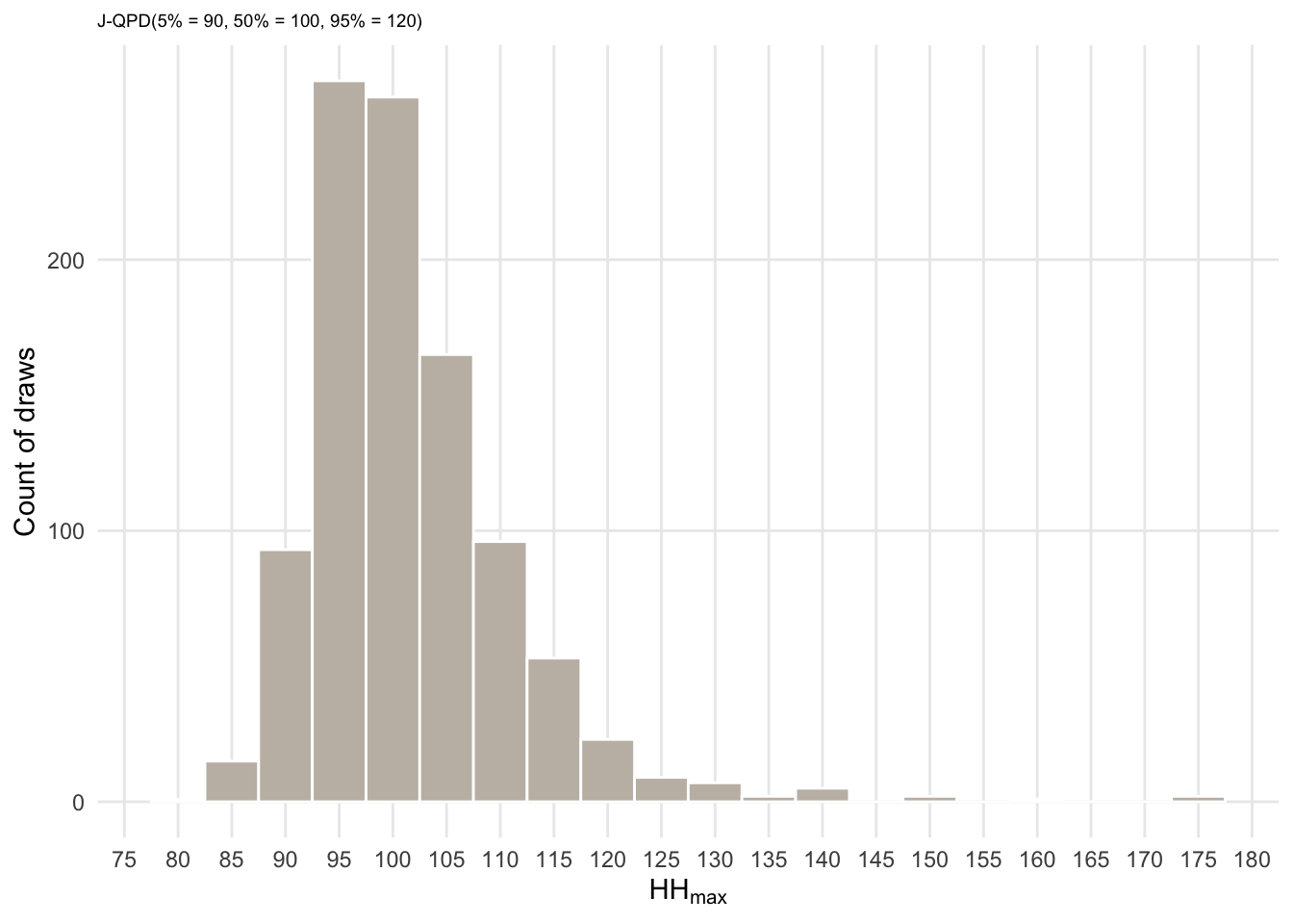
What I like about this approach too, is that plots like the above make it very easy to check whether this simulation adequately reflects your believes! Here you can see that in the majority of the case (universes) HHmax will about 100 million. And you can see the distribution of the other universes and check whether that is really what you believe (e.g., the long right tail. Do we really believe that there is a small chance of 145 million \(HHmax\)? if not, we need to adjust this.)
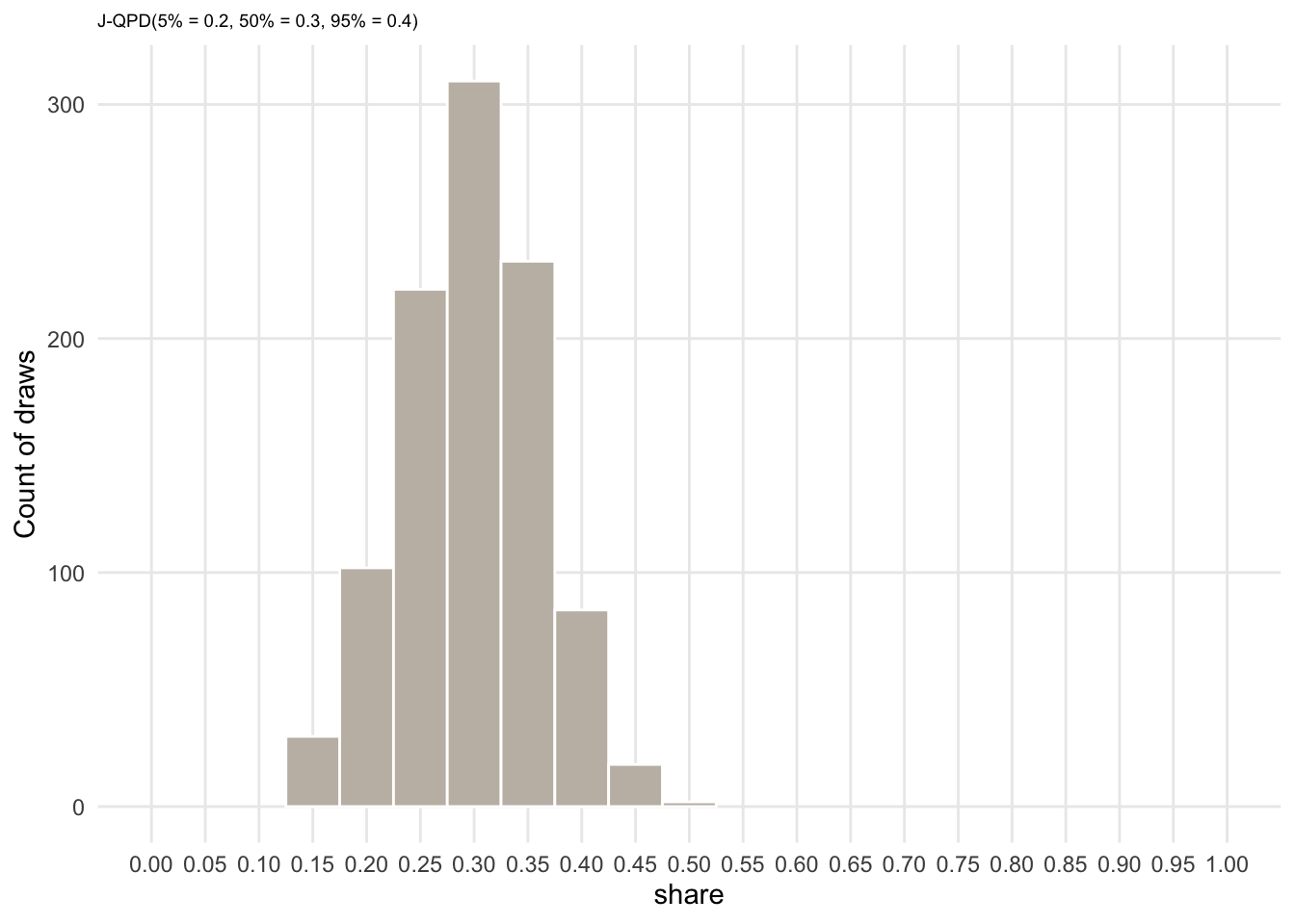
We can do exactly the same for \(share\) and \(m\).
params_share <- jqpd(
  c(0.2, 0.3, 0.4),
  lower = 0, upper = 1,
  alpha = 0.05  # bounds are 5%, 50%, 95%
)
samples_share <- rjqpd(n = n_sims, params_share)

ggplot(data.frame(x = samples_share), aes(x = x)) +
  geom_histogram(binwidth = 0.05, color = "white", fill = col_lgold) +
  labs(y = "Count of draws",
       x = expression(share),
       subtitle = "J-QPD(5% = 0.2, 50% = 0.3, 95% = 0.4)"
  ) +
  theme(plot.subtitle = element_text(size = 7), panel.grid.minor = element_blank()) +
  scale_x_continuous(breaks = seq(0, 1, 0.05)) +
  coord_cartesian(xlim = c(0, 1))
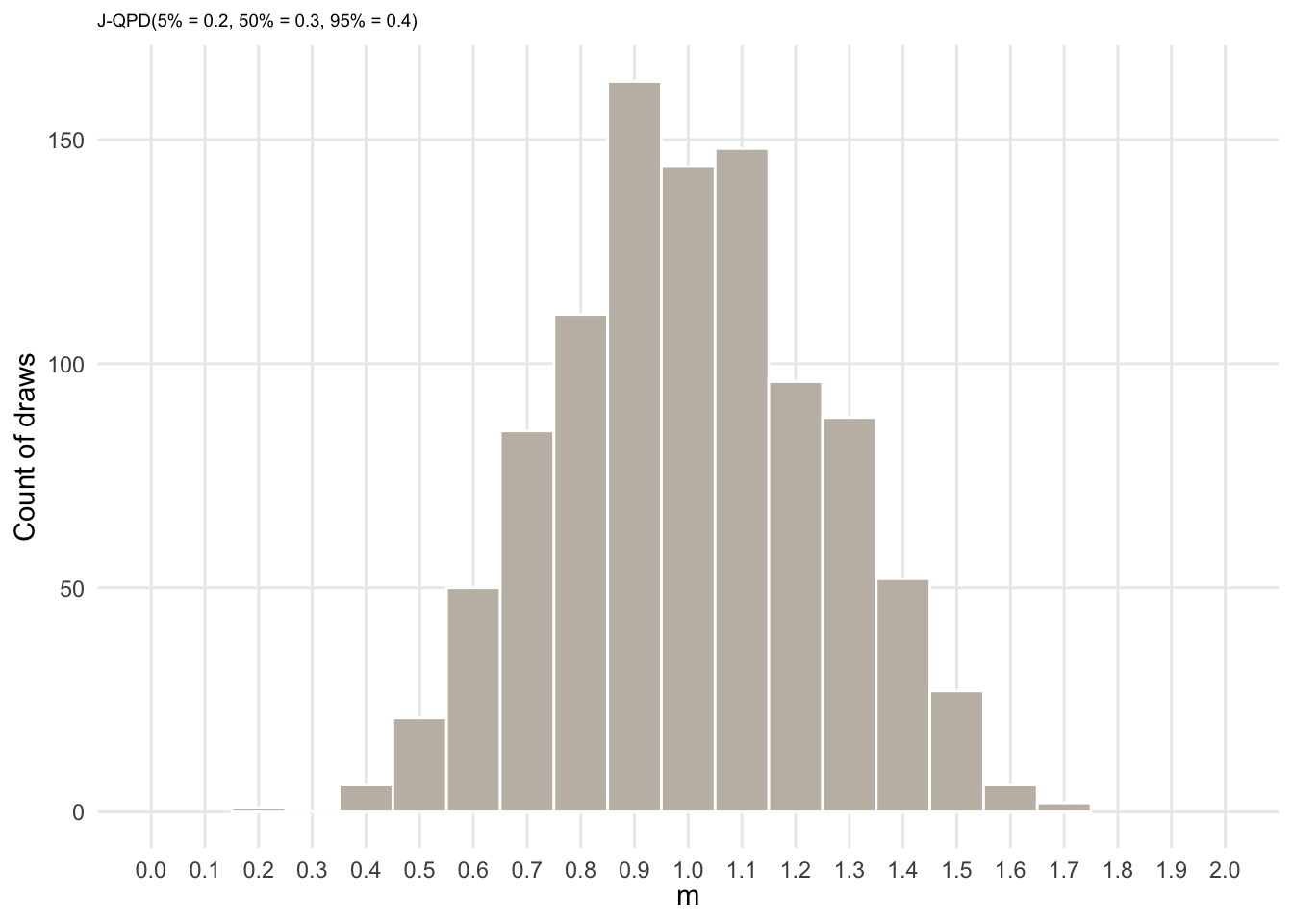
params_m <- jqpd(
  c(0.6, 1.0, 1.4),
  lower = 0.1, upper = 2,
  alpha = 0.05  # bounds are 5%, 50%, 95%
)
samples_m <- rjqpd(n = n_sims, params_m)

ggplot(data.frame(x = samples_m), aes(x = x)) +
  geom_histogram(binwidth = 0.1, color = "white", fill = col_lgold) +
  labs(y = "Count of draws",
       x = expression(m),
       subtitle = "J-QPD(5% = 0.2, 50% = 0.3, 95% = 0.4)"
  ) +
  theme(plot.subtitle = element_text(size = 7), panel.grid.minor = element_blank()) +
  scale_x_continuous(breaks = seq(0, 2, 0.1)) +
  coord_cartesian(xlim = c(0, 2))
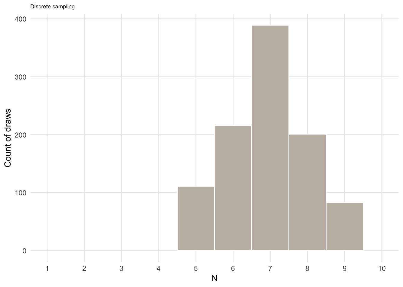
Finally, we need to quanitify our uncertainty about the number of years, \(N\), it takes the market to become saturated. Just to showcase another sampling function, let’s assume that we thing the market will be saturated in x years according to the following probabilities:
N <- c("5" = 0.1, "6" = 0.2, "7" = 0.4, "8" = 0.2, "9" = 0.1)
N
##   5   6   7   8   9
## 0.1 0.2 0.4 0.2 0.1
samples_N <- sample(5:9, size = n_sims, replace = TRUE, prob = N)

ggplot(data.frame(x = samples_N), aes(x = x)) +
  geom_histogram(bins = 5, color = "white", fill = col_lgold) +
  labs(y = "Count of draws",
       x = expression(N),
       subtitle = "Discrete sampling"
  ) +
  theme(plot.subtitle = element_text(size = 7), panel.grid.minor = element_blank()) +
  scale_x_continuous(breaks = seq(1, 10, 1)) +
  coord_cartesian(xlim = c(1, 10))
Now we can put it all together. According to:
$$vol_t = HHmax * sat\_grade_t * share_t$$
we now just need to calculate \(sat\_grade_t\) and then multiply our samples (because of independent sampling) like this:
sat_grade <-
  mapply(function(x, y) gen_trend_series(0, 1, nr_years = x, m = y),
         x = samples_N,
         y = samples_m)

sat_grade[, 1:3]
##            [,1]      [,2]       [,3]
##  [1,] 0.0000000 0.0000000 0.00000000
##  [2,] 0.3114973 0.1798650 0.04958143
##  [3,] 0.4891172 0.3313905 0.13496237
##  [4,] 0.6368562 0.4737893 0.24244274
##  [5,] 0.7680183 0.6105671 0.36737225
##  [6,] 0.8880883 0.7433117 0.50712011
##  [7,] 1.0000000 0.8729282 0.65993753
##  [8,] 1.0000000 1.0000000 0.82455547
##  [9,] 1.0000000 1.0000000 1.00000000
## [10,] 1.0000000 1.0000000 1.00000000
to make the code more understandable here the rest in a for loop:
vol_series <- matrix(NA, nrow = 10, ncol = n_sims)
for (i in seq_len(n_sims)) {
  vol_series[, i] <- samples_HHmax[[i]] * sat_grade[, i] * samples_share[[i]]
}
vol_series[, 1:3]
##           [,1]      [,2]      [,3]
##  [1,]  0.00000  0.000000  0.000000
##  [2,]  8.72598  6.223404  1.904877
##  [3,] 13.70165 11.466248  5.185140
##  [4,] 17.84026 16.393303  9.314445
##  [5,] 21.51451 21.125872 14.114131
##  [6,] 24.87803 25.718889 19.483126
##  [7,] 28.01302 30.203674 25.354241
##  [8,] 28.01302 34.600410 31.678724
##  [9,] 28.01302 34.600410 38.419154
## [10,] 28.01302 34.600410 38.419154
Results
And now, we can plot the result
plot_data <-
  as.data.frame(vol_series) |>
  stack()
plot_data$Year <- rep(1:10, times = n_sims)

ci_data <- data.frame(
  Year = 1:10,
  Median = rowMedians(vol_series),
  Q05 = rowQuantiles(vol_series, prob = 0.05),
  Q25 = rowQuantiles(vol_series, prob = 0.25),
  Q75 = rowQuantiles(vol_series, prob = 0.75),
  Q95 = rowQuantiles(vol_series, prob = 0.95)
)
p1 <-
  ggplot(plot_data, aes(x = Year, y = values, group = ind)) +
  geom_line(alpha = 0.10) +
  labs(subtitle = paste(n_sims, "indidual volume trends"))
p2 <-
  ggplot(ci_data, aes(x = Year)) +
  geom_ribbon(aes(ymin = Q05, ymax = Q95), alpha = 0.5, fill = col_lgold) +
  geom_ribbon(aes(ymin = Q25, ymax = Q75), alpha = 0.5, fill = col_lgold) +
  geom_line(aes(y = Median), color = col_lgold)  +
  labs(subtitle = "Summary via credible intervals") +
  annotate("text",
           x = c(5, 3, 8), y = c(60, 50, 10),
           label = c("5%-95% probability", "25%-75% probability", "Median"),
           color = "gray20", size = 3) +
  annotate("segment",
           x = c(5, 3, 8), y = c(60-1, 50-1, 10+1),
           xend = c(8, 5, 7), yend = c(ci_data[8, "Q95"], ci_data[5, "Q75"], ci_data[7, "Median"]),
           color = "gray40")

fig1 <- p1 + p2  +
  plot_annotation(
  tag_levels = 'A',
  title = 'Quantifying beliefs via simulation',
  subtitle = paste(n_sims, 'random draws (universes)')
) &
  scale_x_continuous(breaks = seq(1, 10, 1)) &
  labs(x = "Year", y = "Sales volume") &
  coord_cartesian(ylim = c(0, 70)) &
  theme(panel.grid.minor = element_blank())

fig1
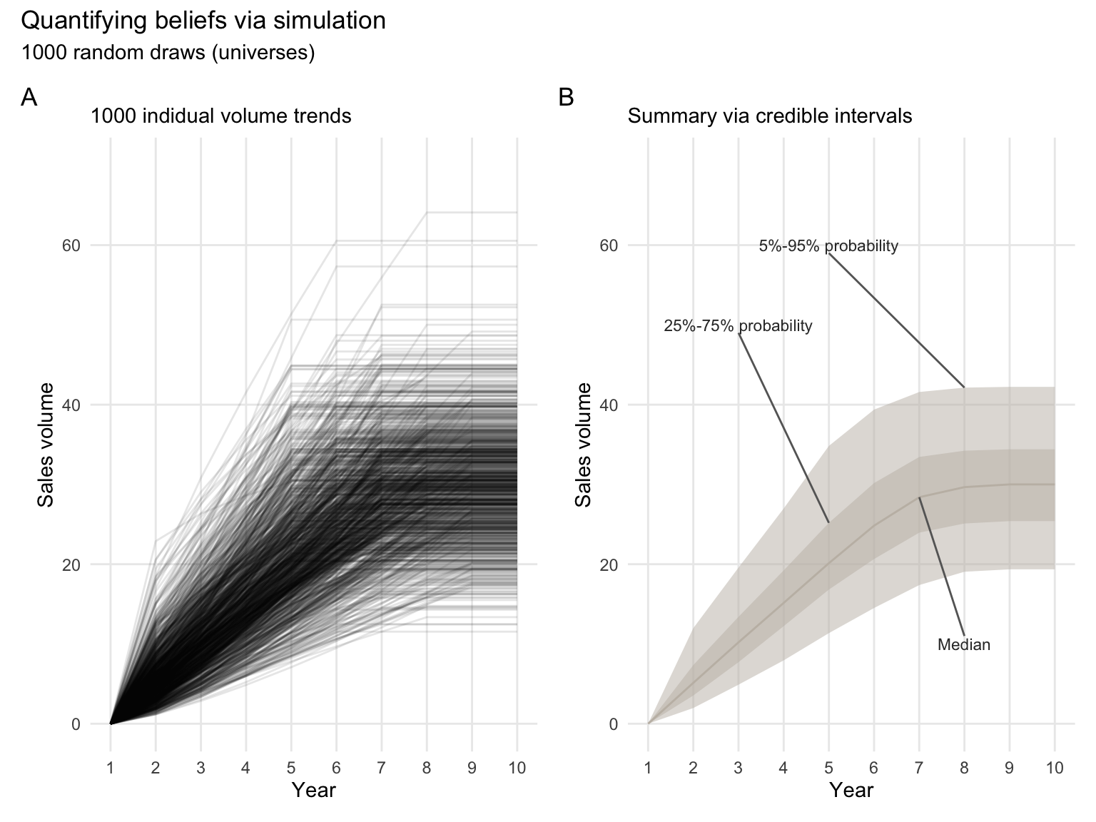
And here is the result, we have propagated our uncertainty and believes about the input parameters into an empirical distribution. This empirical distribution quantifies the resulting believes about which values of yearly sales volume are more likely than others. Essentially, we can derive subjective probabilities from these 1,000 draws.
And we can see, the uncertainty in this model is actually quite big. For example, in year 7, we believe that with 50% probability sales volume will be between 23.65 and 33.01 million. But that there is also a 5% chance that it will be lower than 17.70 million.
round(ci_data, 2)
##    Year Median   Q05   Q25   Q75   Q95
## 1     1   0.00  0.00  0.00  0.00  0.00
## 2     2   5.13  1.97  3.54  7.36 11.99
## 3     3  10.20  4.90  7.72 13.40 19.57
## 4     4  15.15  7.94 12.23 19.22 26.98
## 5     5  20.12 11.36 16.82 25.18 34.83
## 6     6  24.83 14.51 20.65 30.17 39.38
## 7     7  28.40 17.38 23.96 33.45 41.59
## 8     8  29.66 19.05 25.10 34.23 42.14
## 9     9  30.00 19.36 25.40 34.41 42.23
## 10   10  30.00 19.36 25.40 34.41 42.23
Takeaways
What I like about this approach:
- It is so easy to visualize how fast uncertainty propagates and also exactly what form it takes. And you really want to know your forecast uncertainty before making any serious decisions (in my humble opinion). I have not found a better way to communicate this uncertainty as precisely and transparently, as it is done here.
- It is very flexible. You can do your normal modelling. And just add one dimension. Instead of putting in a value for an input assumption, you put in x amount of samples drawn from a sampling distribution that helps you quantify your subjective beliefs
- It is a good guide for highlighting where more research is needed to reduce uncertainty. And conversely, where you simply cannot get more precise forecast given the resources you have.
- I found that the J-QPD is quite helpful for teaching. It is often hard to vocalize your beliefs in detail. But one can often say, “well at the median I would expect this value and I would be highly surprised (e.g., chance 1/20 or 1/00) if it is lower than x and higher than y”.