3 Descriptive Analysis
3.1 Learning goals
- Understand the importance of identifying data patterns
- Evaluate the relevance of visualization and statistical techniques for analyzing data patterns
- Explain and tackle several data challenges
3.2 The importance of descriptive analysis
Descriptive analysis often conjures up images of people staring at dozens of scatter plots, pie charts, and trend lines. This isn’t wrong. Descriptive analysis is all about identifying and describing patterns in the data.
Descriptive (or exploratory) analysis is like looking for the boundary pieces of a puzzle from which to construct the rest of the puzzle. We are looking for structure in the data. From these patterns we derive conjectures about what might possibly be going on. From these conjectures we develop the rest of the analysis.
Take a look at Figure 3.1. It is a famous picture, showing a suprising anomaly in the earnings-per-share distribution of US publicly listed firms. It occurs right at the zero earnings line and looks like a chunk of earnings are missing just below zero earnings. On the other hand right above zero earnings, there seems to be more observations than expected.
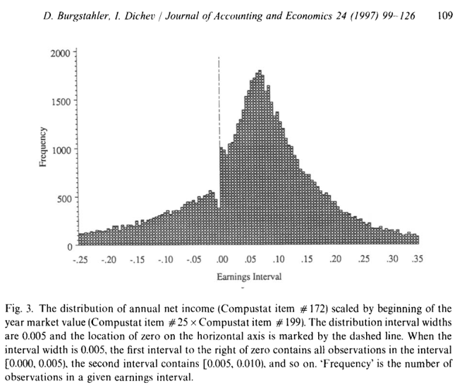
This is figure just describes a pattern in the data. But it immediately lead to several conjectures as to the cause. The most prominent conjecture was that this is a sign of widespread earnings management around the zero earnings benchmark. It sparked a host of studies trying to find support for or against this thesis.
As Figure 3.1 exampliefies, one way to think about descriptive analysis is to view it as part of a hypothesis-building stage. At this stage we ask: 1) How does the data look like? and 2) What is happening? Then we formulate hypotheses as to what might explain what is happening. Thus, descriptive analysis often occurs at the beginning of a project (clarifying the problem) or in the middle when we revisit the data after new insights ocurred (Evaluating actions).
One of the most important reasons for identifying data patterns is to gain insights into trends and relationships. For example, by analyzing sales data, we can identify patterns in customer behavior, such as seasonal fluctuations or changes in buying preferences. Businesses can further identify patterns in demographics related to buying decisions. This information can be used as input to optimize pricing and product offerings and improve customer service. In financial data, data patterns may reveal recurring trends in revenue, expenses, or cash flow. These patterns can help businesses forecast future financial performance, manage risks, and identify opportunities for growth. In operational data, businesses can identify patterns in production processes, supply chain logistics, and inventory management. Data patterns may reveal recurring inefficiencies, bottlenecks, or waste. These patterns give a starting point for businesses to optimize production schedules, reduce costs, and improve efficiency. In marketing data, data patterns may reveal recurring consumer behavior, such as responses to advertising, preferences for certain products or services, or responses to different pricing strategies. Building on these findings, it can help businesses to develop more effective marketing campaigns, improve customer acquisition and retention, and increase revenues. In employee data, data patterns may show insights about employee engagement and performance. This insight can help to identify areas for improvement and develop employee programs that help to increase engagement and performance.
3.3 Definition of data patterns
What do we look for? First we want to understand the the data. Descriptives help to get a picture what we are looking at. For example, when looking at a consuver survey, are we looking at a survey of mostly teenagers or working adults? That is important background for interpreting any patterns we might find. Then we look for informative patterns, or the absence of expected patterns. A pattern is simply a regularity in the data. Very often these are data features that regualrly occur together. Recurring or consistent structures or relations in data. E.g., sales seasonality is a pattern, a systematic relation between sales and time.
Likewise, departures from expected patterns, anomalies and outliers, can yield important insights. Figure 3.1 is an example where there is an anomaly in an expected pattern that hints at something important going on. To give another example: it is well known that traditional financial news coverage has a negative tilt in sentiment. Interestingly, it is the opposite for social media financial news—it has a positive sentiment tilt. (Cookson, Mullins, and Niessner 2024) The potential causes are many. But the simple factoid of a systematic difference in sentiment between tradional news and social media news gives us a clear hint of potentially important differences.
While going through the chapter, please keep in mind that the descriptive analysis is ideally only the first step. Interesting patterns often suggest a potential cause and it is the cause that is of interest. A sales dip below benchmark level that occurs at the same time as the departure of several senior sales managers is pattern that suggests a cause-and-effect relation. Whether the sales team departure really is the cause, cannot be established this way. For that we need diagnostic analysis to rule out alternative explanations. In exploratory analysis it is important to not get carried away and withhold judgement for a while!
3.4 Distributions as fundamental descriptors of data
In simple terms a distribution simply describes how values of a data dimension (e.g., customer age, order amount, deal type) is spread out—is distributed—across its range of possible values.
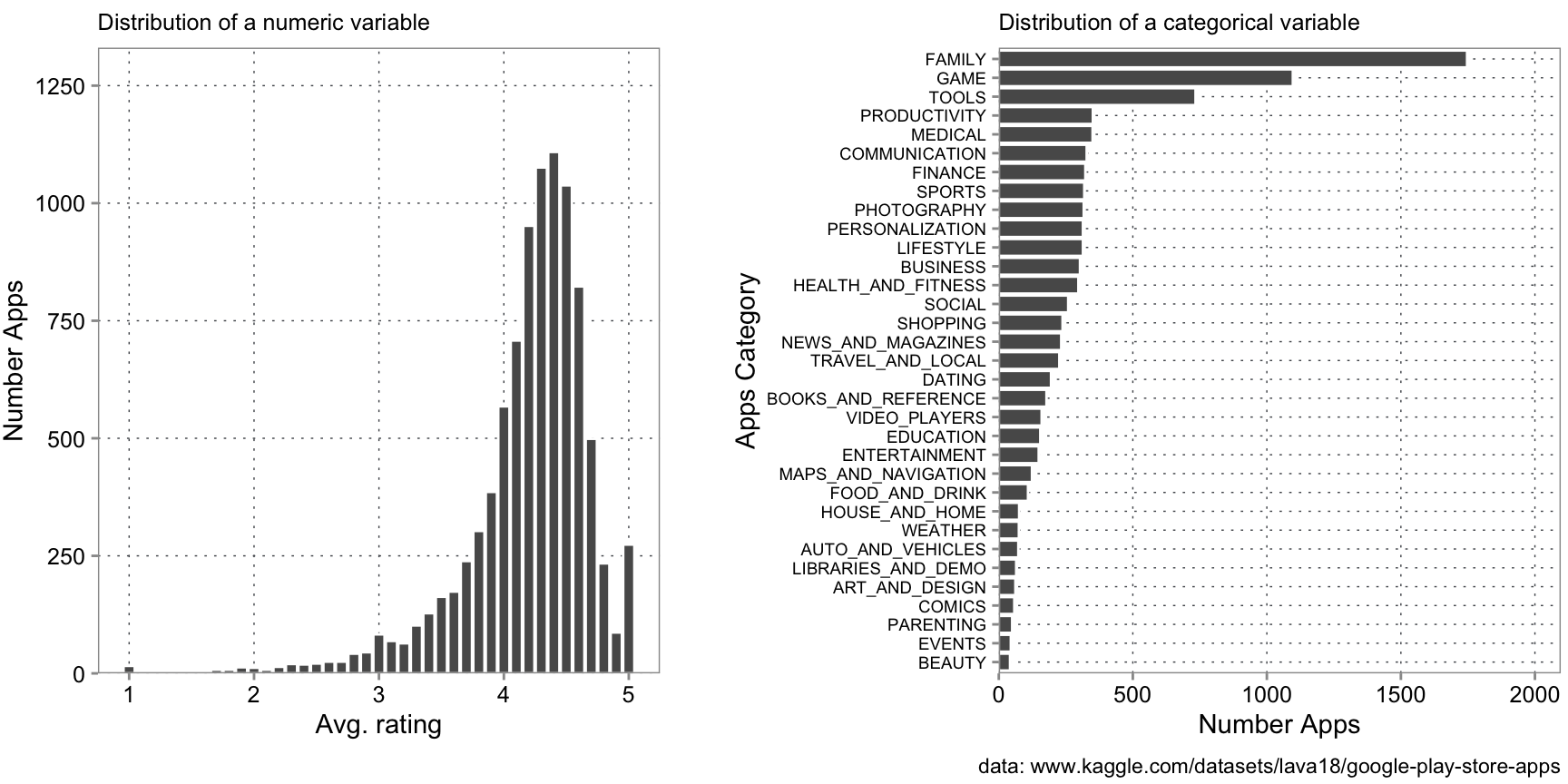
Figure 3.2 shows the distributions of two attributes of Android apps from the Google Play store, the average rating and its category. If you would do an analysis of what makes Android apps popular, you would first want to look at such distributions to get a “feeling” for the data. For example, the graph tells you that in this dataset, most apps have a rating between 4.0 and 4.9. Also, most apps are Family apps and games. This is important background information to judge. For example, without knowing this distribution, you do not know whether a 4.1 (on the higher side of the possible value range) is a good rating or not. Distributions are the key building blocks to understand regularities and deviations from regularities.
To interpret distributions correctly, you need to keep two things in mind. For one, empirical distributions describe how a variable is distributed in the dataset. If the dataset is not representative of the population of interest, for example, because the population has changed since the data got collected or the data collection did not collect a representative sample, then we cannot generalize. In this case, the data we used for the plots above is from the Kaggle competition website and is 6 years old. We do not know how it was collected. Without further inquiries, we do not know whether it describes current rating behavior well.
The second important point relates to how distributions arise in the first place. Why is the average rating in the dataset spread like this? That depends on the “data generating process”, which is just a fancy term we will use for the unknown true world dynamics that lead app users to gives an app a certain rating. Things like the app quality, mood of the user at the time of the review, measurement error, etc are all determinants. And there are many more. All these determinants vary per app, user, and circumstances around the review, leading to ratings to vary too.
An analysis tries to find regularities in this variation. Consider the following example, borrowed from the excellent book “Graphical Data Analysis with R” by Unwin (2015):
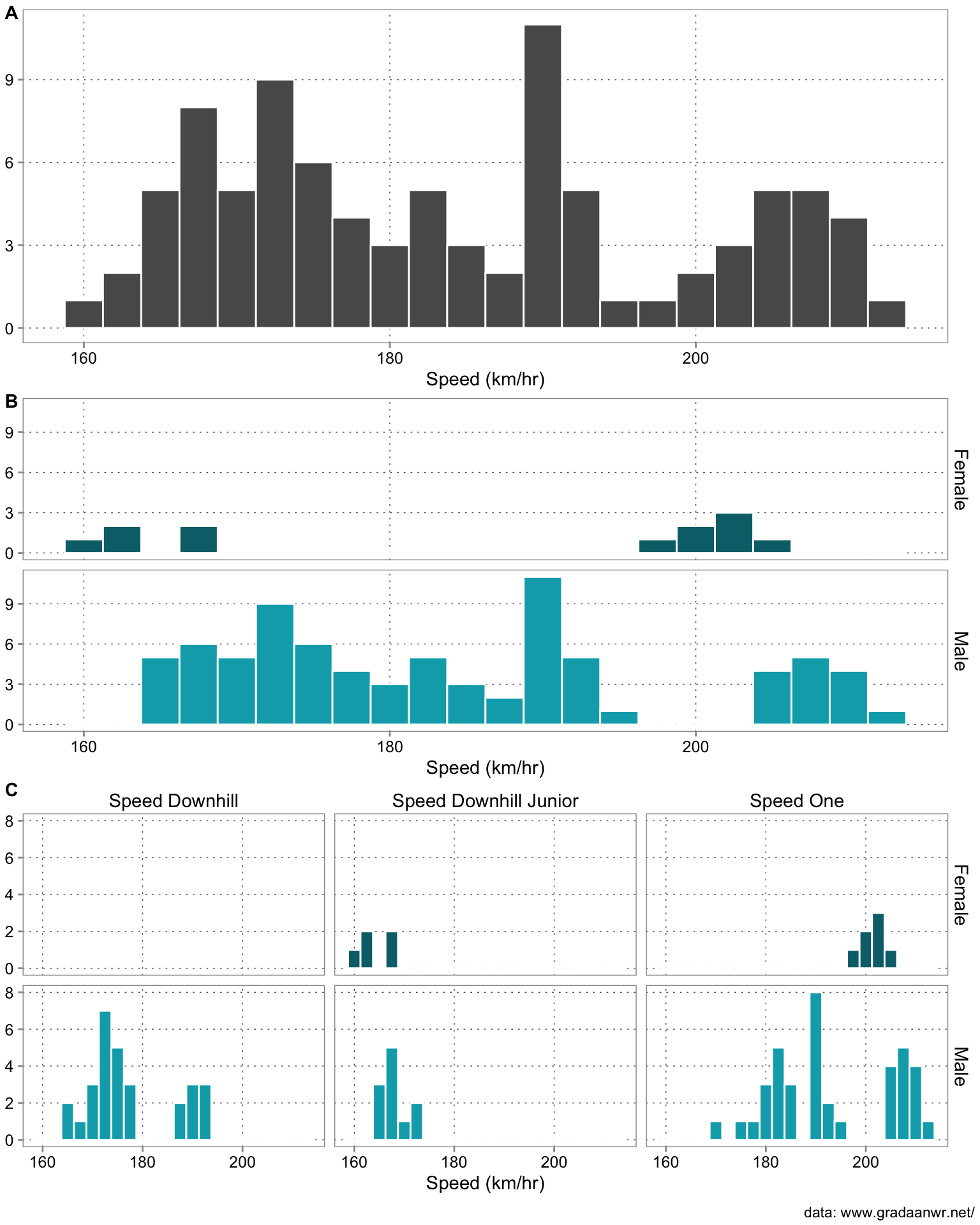
Panel A of Figure 3.3 shows quite a complex distribution of skiiing speeds in the 2011 World Skiing Championships. Panel B shows that part of this patter is distinctly different speeds for female versus male skiers. However that pattern looks a bit odd. Panel C shows why. The reason is that a sizable part of the variation in Panel A is driven by the fact that we have different competitions in this sample. Once we stratify by event, we see that the gender difference becomes much less strong of a pattern.
The example is meant to bring home two points. The first is: Distributions characterize variation and for many problems we are interested in finding the causes for the variation we see. The second point is, descriptive analysis looks for patterns which basically means regularities in the how different data features occur. Very often we find those by comparisons. Here we simply compared distributions of subsets of the data. Analyzing is comparing. In the rest of this chapter we will discuss different techniques to come up with good comparisons (read: analyses).
Both examples show how the identification of simple patterns can kick off analyses to decrease turnover and increase job satisfaction.
3.5 The right mindset
First and foremost, it’s important to approach the data with a sense of curiosity and a desire to understand what it’s telling you. This means asking questions and exploring different angles, rather than simply accepting what you see at face value. By staying curious, you can uncover unexpected insights that might not be immediately obvious. At the same time, it’s important to maintain objectivity when analyzing data. Avoid making assumptions or jumping to conclusions based on preconceived notions. Instead, let the data guide your thinking, and be willing to challenge your own assumptions if the data suggests a different interpretation. This can be particularly challenging if you have pre-existing beliefs about what the data should show, but it’s important to keep an open mind and let the evidence speak for itself. It can be tempting to latch onto a particular idea or theory and look for evidence to support it, but this can lead to confirmation bias and blind you to other potentially important insights. Developing a structured approach to data analysis can also be helpful. By using a systematic approach, you can ensure that you’re analyzing the data in a consistent and rigorous manner, which can help you identify meaningful patterns more easily.
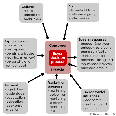
When analyzing the data, it is key to put yourself into the “shoes of the data-generating process”. Remember, the DGP are the unknown true world dynamics that lead to the outcome of interest. Speculating about the data-generating process helps business analysts to understand the underlying mechanism that produces the data they are working with and defines the factors that affect the data. For example, if you want to look into customer behavior, imagine yourself how you act as a customer. Imagine that you are making certain decisions and take actions, thereby actually creating the data (assuming that there is some type of variable measured and recorded that will reflect your decisions and actions). The figure below shows many factors that can influence our buying behavior.
Another example, what aspects would make you enter a drugstore and what aspects would keep you away from the store? Large price boards in the windows, commercial boards standing on the street, or employees handing out samples? What kind of aspects make you choose one hotel, but not the other? Price, proximity to the city center, or the cleanliness rating? And again, then hopefully you have data in your datasets that reflect or at least approximate these aspects such that you can use the data for your analysis. These examples are a bit easier as all of us are customers at some point. However, when you want to analyze bottlenecks in a production process, you probably have to consult your colleagues involved in the production. But even for the customer behavior example, it may be wise to contact colleagues from marketing to get a better picture of decisions customers typically make. You can get additional information from professional magazines or academic papers to put yourself into the data-generating process.
Finally, it’s important to be patient when analyzing data. Finding patterns in data can take time and require persistence. Don’t expect to find all the answers right away, but be willing to put in the effort to uncover insights that can lead to better business decisions. s
3.6 Univariate descriptives: describing one data feature
Before looking at the relationships and patterns of our data and variables, it is generally useful to get a “feeling” for the key variables in the dataset. Visualization can help a lot here. For these visual insights, we typically rely on histograms, bell curves, and box plots to understand the distribution of each variable. An alternative are tables with the most important summary statistics, such as the mean, the amount of variation, minimum and maximum values per variable. Tables are especially useful when there are a lot of variables to look at and compare simultaneously. Summary statistics are statistics that, taken together, summarize the distribution of a variable. For eaxmple, if a variable is truly distributed according to a normal distribution (a specific bell shape), then all you need to completely describe this distribution is its mean (its average) and its standard deviation. Because the distribution is symmetric around its average value and the bell curve is shaping in a fixed ration to its standard deviation. More complicated distributions need more statistics to be adequatly described. We will discuss the most important statistics as we talk about density plots and box plots. Let’s start with the most basic (and very useful) summary of a distribution: its histogram.
3.6.1 Histograms
A histogram is a type of graph that displays the frequency distribution of a continuous or discrete variable, such as sales, revenue, customer demographics, or product performance. By grouping the data into bins or intervals, histograms provide a visual representation of the underlying patterns in the dataset. Histograms are commonly used to identify the shape and spread of a dataset.
For example, let’s say you work with a marketing analyst at your company and you analyze the distribution of customer ages in your customer database. You create a histogram where the x-axis represents age intervals, and the y-axis represents the count of customers falling within each age interval.
Code
s1 |>
  ggplot(aes(x = Age)) +
  geom_histogram(
    # binwidth = 5
    breaks = seq(20, 80, 5),
    color = "white"
    ) +
  scale_y_continuous(
    expand = expansion(mult = c(0, 0.02)),
    n.breaks = 6
    ) +
  scale_x_continuous(breaks = seq(20, 80, 5)) +
  labs(
    y = "Count by bin",
    x = "Age bins",
  ) +
  theme(
    panel.grid.major.x = element_blank()
  )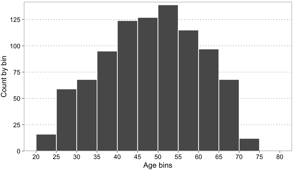
By examining the shape of the histogram, analysts can identify trends and patterns, such as whether the distribution is symmetric, skewed, or has other notable characteristics. Histograms can help analysts to visualize various statistical measures, such as the mean, median, mode, and measures of dispersion (e.g., variance or standard deviation) (see 3.5.3). In the example above, you see that it seems that customer age follows a normal distribution (see also bell curve). You also see whether there is any interesting variation in the data useful for further statistical analysis. E.g., if all age bins would contain the same number of customers, there is no age variation that can be used to explain, e.g., customer behavior. However, we do not need to worry in this example as we can identify variation from the age bins. Furthermore, histograms can serve as a basis for fitting parametric models, such as normal, log-normal, or exponential distributions, to the data. These models can then be used for predictive analytics, forecasting, and other advanced statistical analyses, which can provide valuable insights for decision-making and strategic planning.
Additionally, from a business decision perspective, you can identify any patterns that may exist in the age distribution of your customer base. In this example, you see that most customers are between 48 and 52 years old. This information can help guide marketing efforts towards the specific age group that is most likely to purchase your products or services. At the same time, if you believe that your product or service should theoretically be very interesting for people of the age around 35, you could further investigate reasons why people in that age category do not buy the product as much. Additionally, histograms can be used to identify any potential outliers or unusual patterns in the customer age data. For example, if the histogram reveals a sudden spike in a specific age group, it might indicate a data entry error, an anomaly in the dataset, or an emerging trend that requires further investigation.
Another application of histograms in analyzing customer age data is to compare the age distribution of different customer segments, such as those who make online purchases versus those who shop in-store. By comparing the histograms, a business can identify differences in customer preferences and behaviors, allowing it to fine-tune its marketing and sales strategies accordingly.
Similar to a histogram, you may come across a density plot.
3.6.2 Describing continuous data
3.6.2.1 Density plots
Code
s1 |>
  ggplot(aes(x = Age)) +
  geom_density(
    color = "red",
    fill = "red", alpha = 0.1
    ) +
  scale_y_continuous(
    expand = expansion(mult = c(0, 0.02)),
    n.breaks = 6
    ) +
  scale_x_continuous(breaks = seq(20, 80, 5), limits = c(15, 85)) +
  stat_function(fun = dnorm,
                geom = "area",
                color = "dodgerblue",
                fill = "dodgerblue",
                alpha = 0.4,
                xlim = c(0, quantile(age, 0.16)),
                args = list(
                  mean = mean(age),
                  sd = sd(age)
                )) +
    stat_function(fun = dnorm,
                geom = "area",
                color = "dodgerblue",
                fill = "dodgerblue",
                alpha = 0.8,
                xlim = c(quantile(age, 0.16), quantile(age, 0.84)),
                args = list(
                  mean = mean(age),
                  sd = sd(age)
                )) +
  stat_function(fun = dnorm,
                geom = "area",
                color = "dodgerblue",
                fill = "dodgerblue",
                alpha = 0.4,
                xlim = c(quantile(age, 0.84), 80),
                args = list(
                  mean = mean(age),
                  sd = sd(age)
                )) +
  annotate(
    "line",
    x = c(quantile(age, 0.16), quantile(age, 0.84)),
    y = c(0.01, 0.01)
  ) +
  annotate(
    "text",
    x = mean(s1$Age),
    y = 0.011,
    size = 3,
    label = "One standard deviation (68%)"
  ) +
  labs(
    y = "Density",
    x = "Age",
  ) +
  theme(
    panel.grid.major.x = element_blank()
  )
Warning: Removed 43 rows containing missing values or values outside the scale range
(`geom_area()`).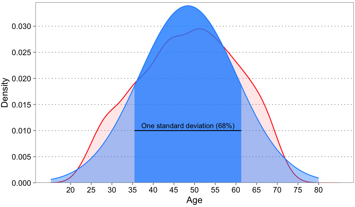
Figure 3.6 shows a density plot of a distribution (in red). It shows exactly the same data as the histogram before, only in a continuous fashion (think very small bins). On top we overlaid a bell curve (also known as normal distributions or Gaussian distributions) Bell curves are often used as benchmarks, as we do here. When data follows a normal distribution, the mean, median, and mode are equal, and approximately 68% of the data falls within one standard deviation of the mean, 95% within two standard deviations, and 99.7% within three standard deviations. These specific properties can simplify calculations and provide a foundation for hypothesis testing and other statistical procedures. Density plots are often useful when we directly want to compare multiple distributions directly, something that is just visually very “busy” with histograms.
3.6.2.2 Box plots
A box plot, also known as a box-and-whisker plot, is a type of chart that displays a reduce representation of a variable’s distribution by showing its median, quartiles, and outliers.
Code
age2 <- c(13, age)
q_ages <- quantile(age2, c(0.25, 0.5, 0.75))
lb <- q_ages[2] - 1.5 * IQR(age2)
ub <- q_ages[2] + 1.5 * IQR(age2)
data.frame(Age = age2) |>
  ggplot(aes(y = Age)) +
  geom_boxplot(
    width = 0.2,
    fill = "dodgerblue",
    outlier.colour = "orange", outlier.shape = 19, outlier.size = 3
    ) +
  scale_x_continuous(breaks = seq(-0.2, 0.2, 0.1), limits = c(-0.2, 0.2)) +
  labs(
    x = NULL,
    y = "Age"
  ) +
  annotate(
    "text",
    x = 0.11,
    y = c(13, lb, q_ages, 72),
    label = round(c(13, lb, q_ages, 72))
    ) +
  theme(
    panel.grid.major.x = element_blank(),
    axis.ticks.x = element_blank(),
    axis.text.x = element_blank()
  )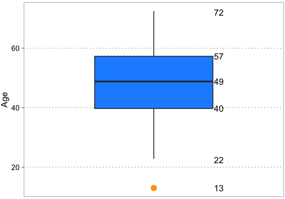
The box represents the interquartile range (IQR, see 3.5.3.1.4), which contains the middle 50% of the data. The box extends from the lower quartile (Q1) to the upper quartile (Q3). The median line is the line within the box that represents the median (Q2) of the dataset. The whiskers (probably coming from cat whiskers) are the lines extending from the box and represent the range of the data, excluding outliers. The whiskers typically extend to the minimum and maximum data points within 1.5 or 3 times the IQR from Q1 and Q3, respectively. Outliers are data points that fall outside the whiskers, typically represented by individual points or symbols. Using an adjusted dataset from the histogram, this box plot indicates a relatively normal distribution given that the median is in the middle and the same length of the quartiles. If the box is short and the whiskers are long, the data are spread out and there may be many outliers. If the box is tall and the whiskers are short, the data are tightly clustered and there may be few outliers. We see that indeed one outlier in terms of age exists, giving reason to further investigate how to deal with it. Alternatively, this could hint a data quality issue.
Since box plots throw a lot of information away, to us they are most often useful when comparing variation across many categories. Going back to the google play store example, drawing a distribution for each category will get messy (try for yourself). A comparison of box plots can make it easier to spot patterns fast. This is already an example of a a bivariate comparison though (see below).
3.6.3 Describing categorical data with proportions
3.6.3.1 pie charts
Proportions refer to the comparison of data between different groups or categories, and involves examining how data varies relative to other factors. Imagine a simple count of employees in different age categories, revenues per product line, or marketing expenses per marketing channel. Common visualizations to express proportions are pie charts or tree map charts (amongst others).
Of course we can present proportions also with bar charts. In fact, in a lot of cases, that is probably a better choice as it is easier to compars bars side-to-side than the relative size of pies in a pie-chart. A pie chart is a type of chart used to display data in a circular graph. It is composed of a circle divided into slices, each representing a portion of the whole. The size of each slice is proportional to the quantity it represents, with the entire circle representing 100% of the data. Pie charts are commonly used to show the distribution of a set of categorical data, where each slice represents a different category or group. The size of each slice is determined by the percentage or fraction of the data that belongs to that category. While bar charts are perceptually clearer, pie charts are useful because they are an intuitive and compact way to compare the relative sizes of different categories. They also allow for the easy identification of the largest and smallest categories and can be effective in communicating the overall pattern or trend in the data.
Code
Z <-
  table(cut(age, seq(20, 80, 10))) |>
  as.data.frame()
Z$prop <- Z$Freq / length(age)
Z <- Z %>%
  mutate(csum = rev(cumsum(rev(prop))),
         pos = prop/2 + lead(csum, 1),
         pos = if_else(is.na(pos), prop/2, pos))

ggplot(Z, aes(x="", y=prop, fill=(Var1))) +
  geom_bar(stat = "identity", width = 1, color = "white") +
  coord_polar("y", start=0) +
  # geom_text_repel(aes(y = pos, label = paste0(round(prop*100), "%")),
  #                  size = 3, nudge_x = 1, show.legend = FALSE) +
  theme(axis.ticks = element_blank(),
        axis.title = element_blank(),
        axis.text = element_text(size = 10),
        panel.background = element_rect(fill = "white"),
        panel.border = element_blank(),
        panel.grid = element_blank(),
        legend.position = "left"
        )+
  scale_y_continuous(breaks = Z$pos, labels = paste0(round(Z$prop*100), "%")) +
  scale_fill_brewer(palette = 1, name = "Age Group")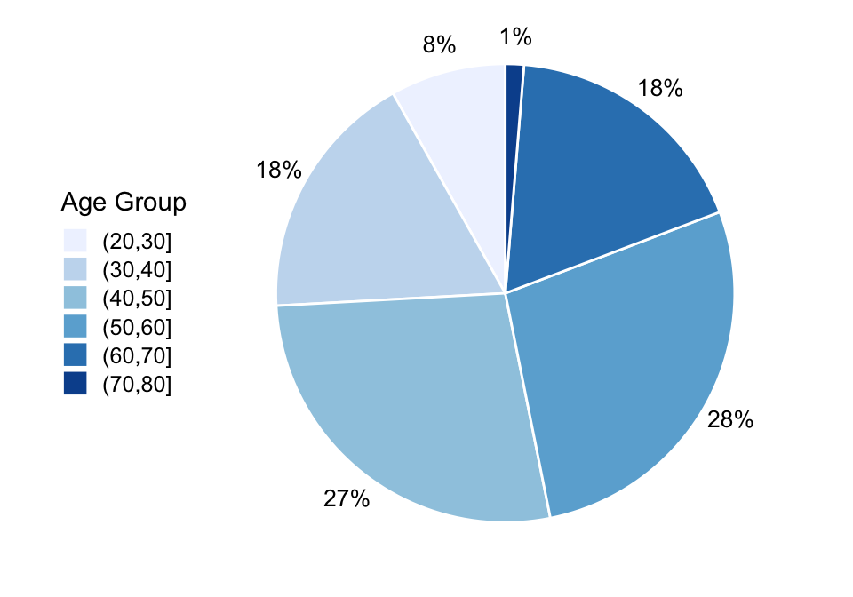
The pie chart above displays HR firm data on age categories and proportion of employees in their respective age categories. It is a succinct way to present the age distribution of your workforce. You can quickly identify that the age group of employees between 41 and 50 is most frequently observed in that firm. In addition, you see that there is a relatively low proportion of younger people. This is alarming if you think about succession and business continuity, and further analysis is needed in that regard.
3.6.3.2 Barcharts
Ranking in the context of data visualization refers to the process of ordering data points based on a specific variable or criterion. This allows for the quick identification of the highest or lowest values. The most common visualizations are bar charts and radar charts (amongst others).
A bar chart, also known as a bar graph, is a type of chart or graph that represents data using rectangular bars. The length or height of each bar is proportional to the value it represents. Bar charts can be used to display data in horizontal or horizontal orientation, with the latter usually called a column chart (see also 3.5.2.5).
Code
Z <- data.frame(
  product = paste("Product", LETTERS[1:5]),
  failure_rate = c(0.083, 0.015, 0.02, 0.032, 0.038)
)
Z$status = if_else(Z$failure_rate > 0.05, "bad", "ok")

ggplot(Z,
  aes(
    y = fct_reorder(product, -failure_rate),
    x = failure_rate,
    fill = status
  ),
) +
  geom_col(color = "white") +
  scale_x_continuous(labels = scales::label_percent(), expand = expansion(c(0, 0.02))) +
  theme(
    legend.position = "none",
    panel.grid.major.y = element_blank()
  ) +
  geom_vline(xintercept = 0.05) +
  annotate("text", x = 0.05, y = 1, label = "5% threshold", vjust = 0.5, hjust = -0.1) +
  labs(
    y = NULL,
    x = "Failure rate after x months"
  )
Suppose you are a quality control manager at your manufacturing company. The bar chart above includes failure rates per product category. It becomes clear that Product A should be more closely investigated given the seemingly higher failure rate compared to the other products. Notice how small tweaks add to make the punch line of the plot as obivous as possible: the choice of two colors, annotating the plot with a vertical line, and ordering the products so that the “worst” product is at the bottom
3.7 Comparisons of two features
3.7.1 Comparing two continuous variables
3.7.1.1 Scatterplots
A scatter plot is a type of graph that uses dots to represent values for two different variables. The position of each dot on the graph represents the values of the two variables.
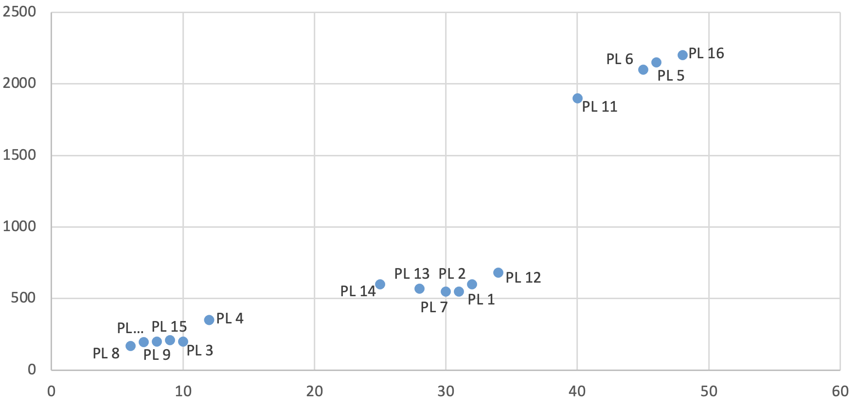
Suppose you are a plant manager at a manufacturing company, and you want to analyze the relationship between production output and energy consumption. You have data on the daily production output (x-axis) and energy consumption (y-axis) for each production line (PL) over the past year. First of all, you notice that there appears to be a relationship between production output and energy consumption. In addition, several clusters of data points are tightly grouped together. It appears that the product lines in the cluster in the middle may be more energy-efficient than others in their production given that the cluster appears low on the y-axis.
Scatter plots are also useful to detect outliers which would imply that one (or multiple) of the data points would appear further away from the other clusters.
3.7.1.2 Correlations
To identify correlations between variables visually, most often scatter plots are used as well.
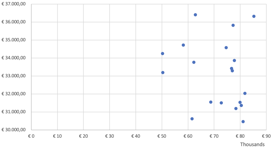
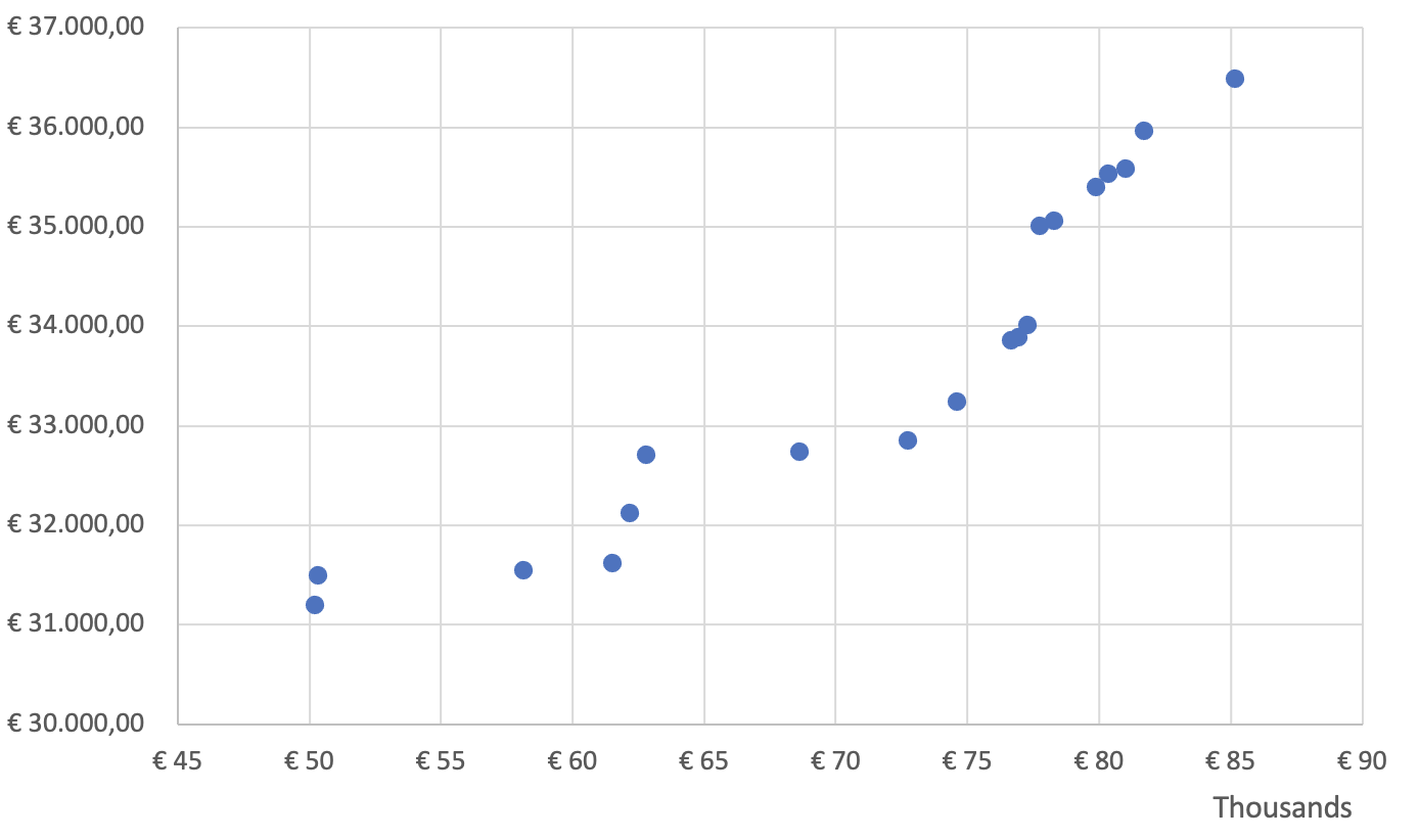
Imagine a friend of yours is a financial analyst, and asks you to check the relationship between revenue and expenses of a company over the past year. You can create a scatter plot where the x-axis represents revenue, and the y-axis represents expenses. Let’s look at two different outcomes. If the outcome looks like the first scatter plot, you can most likely conclude from the visual that there is no correlation between revenues and expenses. If you consider the second scatter plot, it appears that there is a correlation between revenues and expenses. You conclude that both variables move in the same direction, and you can further investigate the underlying reasons.
And that was a journey throughout the most common charts and graphs used to identify data patterns. Yet, in general, it should be noted that some charts can be used for multiple purposes. For example, a bar chart can also be used to identify relative proportions. The number of categories represented in such charts also has an influence on the choice. For example, if a firm has 30 different products, it may indeed be wise to you use a bar chart or column chart to represent those products; a pie chart would be too cramped to read given many “pie pieces” reflecting the products. But some types of visualizations are also simply not useful for some purposes. For example, if we want to identify any changes over time, a pie chart is not going to help us reflecting such changes.
3.7.2 Comparing Continuous and Categorical variables
Often this can be done by combining plots we have seen before. For example, here are boxplots of average app ratings (a more or less continuous variable) across the various app categories. Box plots are often used for this purpose as they are less noisy than full distributions. The reduced nature draws our eyes to the means and spread differences.
Code
pdta <-
  gpstore |>
  filter(Rating <= 5)
pdta |>
  ggplot(aes(x = Rating, y = fct_reorder(Category, Rating))) +
  geom_boxplot(
    width = 0.2,
    fill = "dodgerblue",
    outlier.colour = "orange", outlier.shape = 19, outlier.size = 1, outlier.alpha = 0.1
    ) +
  geom_vline(xintercept = mean(pdta$Rating)) +
  labs(x = "Avg. App Rating", y = "App Category")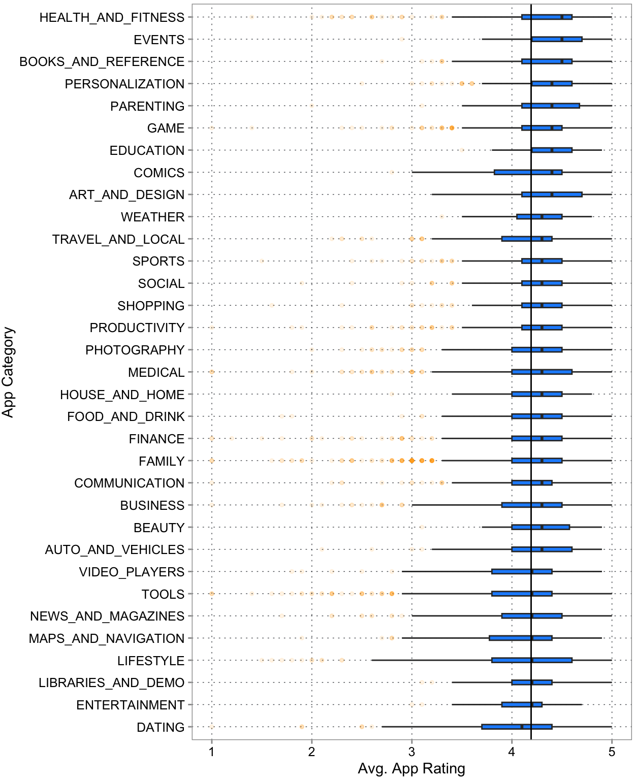
Figure 3.10 reveals a few insights. First, on the bottom part, Dating apps are not loved by users. They are the only category with the mean below the average line and a significant amount of mass below the line. One the top, Events looks like the category with the best rated apps overall. Its interquartile range is close to being above the average line (suggesting that more that only about 25% of Event appes are below the average line) and its mean is very high. And other than that, another insight is that there isn’t super much variation just accross categories.
As a comparison, we have too many categories here to compare histograms. It is even hard to format the plot well.
Code
pdta <-
  gpstore |>
  filter(Rating <= 5)
pdta |>
  ggplot(aes(x = Rating)) +
  geom_bar() +
  facet_grid(rows=vars(fct_reorder(Category, Rating))) +
  geom_vline(xintercept = mean(pdta$Rating)) +
  labs(x = "Avg. App Rating", y = "App Category")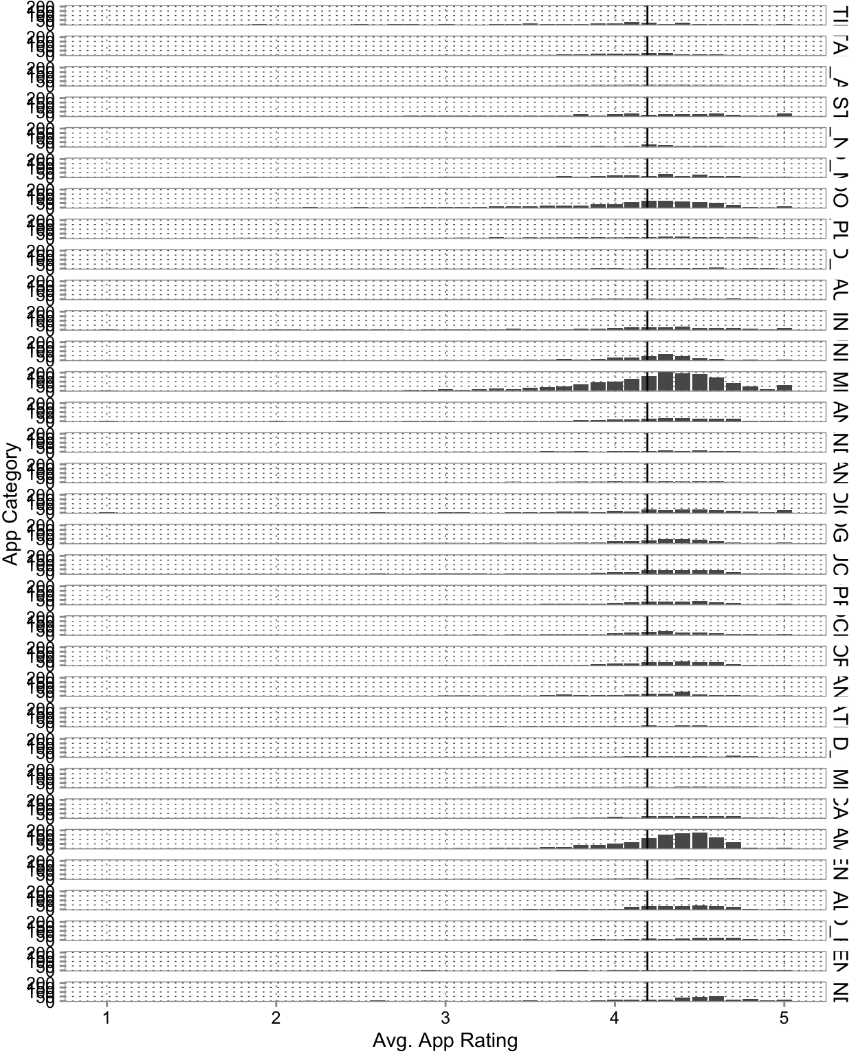
The only thing that works equally well (in our opinion), but have less clear anchors for our analysis are so called ridgeline plots. The following plot uses the same data as Figure 3.10, only as densities. The same inferences can be drawn. But the means are and interquartile ranges are less clear. What is more obvious are the long tails of some of these categories.
Code
 pdta <-
  gpstore |>
  filter(Rating <= 5)
pdta |>
  ggplot(aes(x = Rating, y = fct_reorder(Category, Rating))) +
  ggridges::geom_density_ridges(fill = cl[["blue2"]]) +
  geom_vline(xintercept = mean(pdta$Rating)) +
  labs(x = "Avg. App Rating", y = "App Category")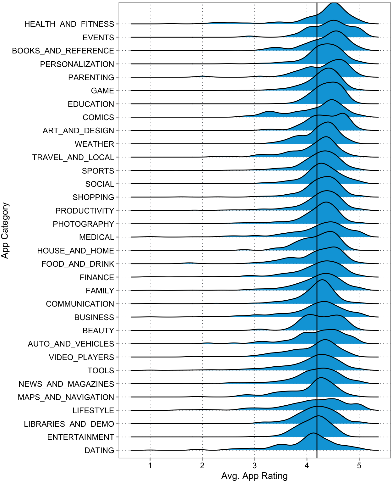
3.8 Multiple Comparisons
3.8.1 Comparing multiple continuous variables
For three continuous dimensions, a common visualization form is bubble charts. Effectively we just add one more dimension to the scatter plot, which is the size of the points. We could potentially add even more, for example a fourth dimension using color. However, this often becomes messy fast. In practice it is rarely a good idea to try to visualize too many dimensions at the same time.
A bubble chart is a type of chart that displays data points as bubbles or circles on a two-dimensional graph. Each bubble represents a data point and is located at the intersection of two variables on the graph. The size of the bubble represents a third variable, typically a quantitative value, and can be used to convey additional information about the data point. Bubble charts are useful for displaying data with three variables, where two variables are plotted on the x- and y-axes, and the third variable is represented by the size of the bubble. This allows for the visualization of complex relationships between variables and can be used to identify patterns or trends in the data.
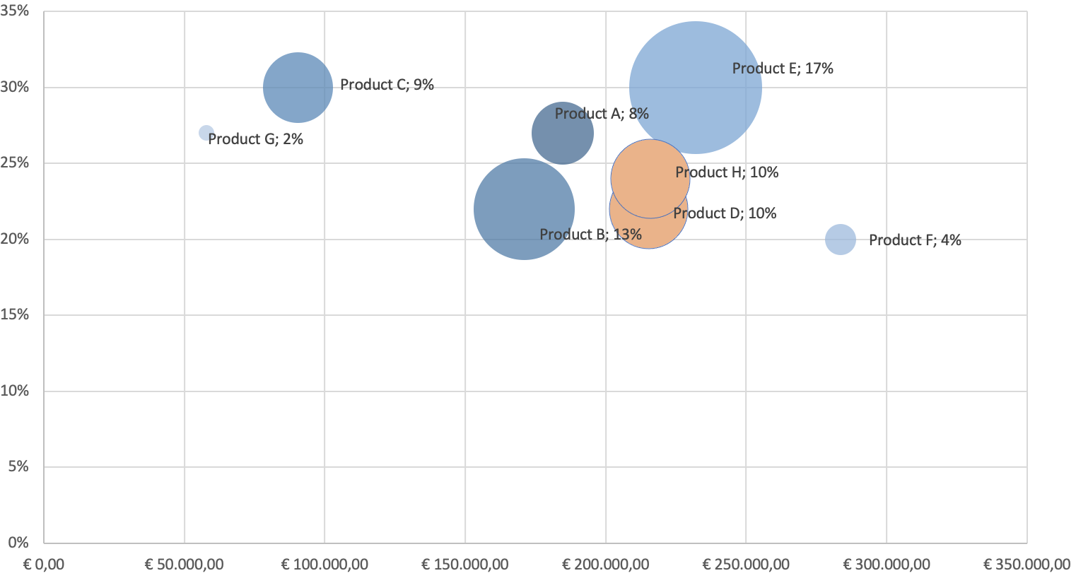
Imagine you help the controller in your retail company. The bubble chart above reflects financial data on each product’s revenue (x-axis), gross profit margin (y-axis), and operating profit margin (bubble size). The bubble chart allows you to quickly identify which products are generating the most revenue (Product F) and gross profit margin (Product C and E), as well as which ones have the highest operating profit margin (Product E). You could also identify any outliers, such as products with high revenue but low gross profit margin (Product F), or a product with low revenue but high operating profit margin (Product C). This information provides a first insight into which products to invest in, which ones to cut back on, and how to optimize your overall financial performance.
Furthermore, you can color-code the bubbles based on the product category or production location to find patterns in other common characteristics, or clusters. Suppose that the orange bubbles represent the same production site: this could indicate that the production is similarly efficient as both products have an operating profit margin of 10% (and have similar revenue and gross profit margins). However, as with all initial evidence based on data patterns, this has to be further investigated as there might be many more reasons for such a similar operating profit margin.
3.8.2 Multiple Comparisons for categorical data
A simple thing here is to compare bar charts or proportions for different categories.
If categories are nested, a tree map chart or mosaic chart is a type of chart that displays hierarchical data as a set of nested rectangles. It is often used when you want to examine proportions for multiple nested categories. These are often advocated when the variable of interest has many categories. They can become confusing fast though. The need to be designed with care. The size and color of the rectangles represent the relative sizes of the different categories or data points, with larger rectangles representing larger values and different colors representing different categories. Rectangles can be nested into subgroups. While you can nest this many layers, in practice this is seldom a good idea.
Code
Z <- data.frame(
  Campaign = c("TV ads", "Magazines", "Billboards", "Social media ads", "Email campaigns", "Influence"),
  Budget = c(46, 6, 24, 23, 3, 15) * 1000,
  traditional = c("Traditional", "Traditional", "Traditional", "Online", "Online", "Online")
)

my_palette <- scales::brewer_pal(palette = 1)(9)[4:9]

ggplot(Z, aes(area = Budget,
              fill = Campaign,
              label = paste(Campaign,
                             scales::label_currency()(Budget), sep = "\n"),
              subgroup = traditional
            )
      ) +
  geom_treemap() +
  geom_treemap_subgroup_border(colour = cl[["petrol"]], size = 2) +
  geom_treemap_subgroup_text(place = "centre", grow = T, colour =
                             cl[["petrol"]], fontface = "italic", min.size = 0) +
  geom_treemap_text(colour = "white",
                    place = "centre",
                    size = 10,
                    ) +
  scale_fill_manual(values = my_palette) +
  theme(legend.position = "none")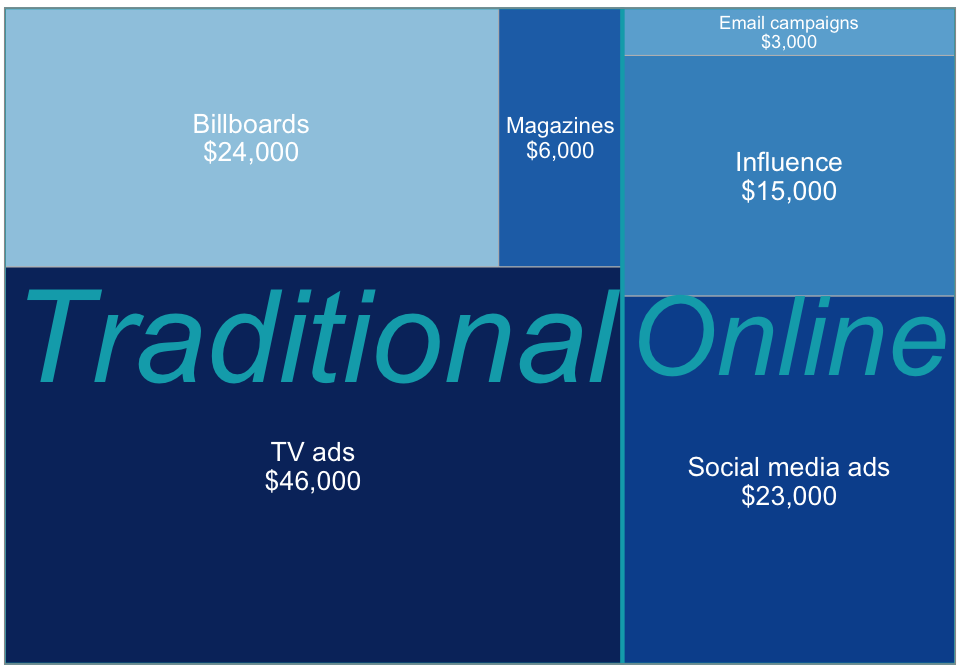
Suppose the marketing manager of your firm approached you to dig into their expense data. The tree map above includes marketing data on the expenses per marketing channel, with TV ads clearly making up the largest proportion of expenses. It also groups the six channels into traditional and online channels, giving us a quick sense of propotion for this group too. This information helps you understand how your marketing expenses are allocated across different channels and you can start further investigations into how far each channel is successful in, e.g., acquiring new customers, and whether the expenses allocated to the respective channels are justified.
3.8.3 Radar charts
A radar chart, also known as a spider chart or a web chart, is a type of chart that displays data on a polar coordinate system. Radar charts are useful for comparing multiple features of the data across different categories. Each category is represented by a different line or shape on the chart, with each variable represented by a spoke. The length of each line or shape corresponds to the magnitude of the data for that variable, and the different lines or shapes can be compared to one another.
Code
# remotes::install_github("ricardo-bion/ggradar")

Z <- data.frame(
  product = c("A", "B", "C"),
  Price = c(8, 10, 14),
  Quality = c(10, 11, 9),
  Popularity = c(8, 9, 11),
  Durabil. = c(10, 4, 7)
)
lcols <- c("#EEA236", "#5CB85C", "#46B8DA")
ggradar(
  Z,
  background.circle.colour = "white",
  axis.line.colour = "gray60",
  gridline.min.colour = "gray60",
  gridline.mid.colour = "gray60",
  gridline.max.colour = "gray60",
  gridline.min.linetype = 1,
  gridline.mid.linetype = 1,
  gridline.max.linetype = 1,
  legend.title = "Product",
  legend.position = "bottom",
  group.colours = lcols
)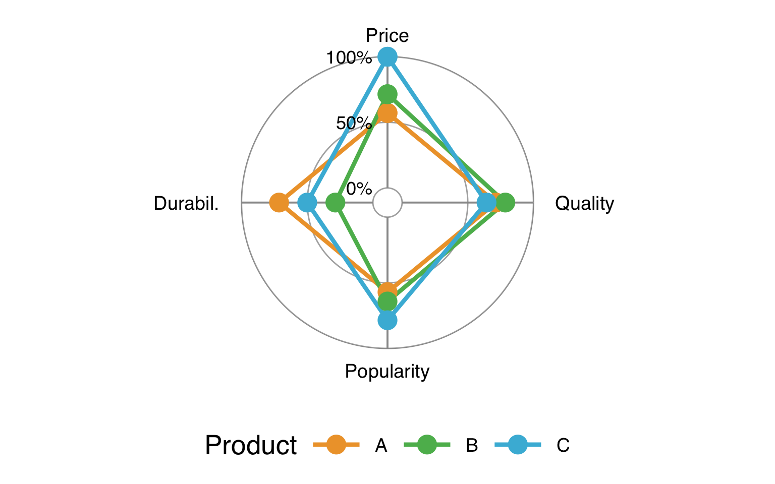
Imagine you are a product manager at your retail company. In the radar chart above, three products are compared based on their properties of price, quality, popularity, and durability. An interesting observation, e.g., is that Product C has the highest price and highest popularity while having the lowest quality. This is interesting because usually, one would expect that a high price and low quality would negatively affect popularity, so it is worth further investigating whether, e.g., a certain minimum requirement for quality is already met and therefore does not impact popularity. Or another potential feature is missing that might explain the popularity despite high price and low quality.
Another important use of visualizations: This interesting finding could also hint at a data problem. Visualization can also help us identify data quality issues, such as missing or outlier values, which may be less noticeable when examining raw data. Any data points out of the order may provide a signal for you to review the quality of the data (see also section 3.6).
3.9 Summary statistics
So far we have looked at visualizations. While visualizations are great approach to start the analysis process, eventually we also want to “crunch” the numbers. The intuition we got from discussing distributions and comparisons will come in handy now. First we discuss summary statistics. The are measures that quantify certain properties of a distribtion (like average or mean as a measure of central tendency) or quantifiying the strengt of relations (e.g., a correlation coefficient)
3.9.1 Measures of central tendency (mean, median, mode)
Measures of central tendency are statistical measures that describe the central or typical value of a set of data. They are often used to summarize large datasets and provide insights into the characteristics of the data. The three most common measures of central tendency are mean, median, and mode.
The mean (\(x̄\)) is the arithmetic average of a set of numbers. It is calculated by adding up all the values in a set and dividing the sum by the number of values. The mean is sensitive to outliers in the data, which can greatly influence its value. For example, if we have a dataset of 5, 10, 15, 20, and 25, the mean would be (5+10+15+20+25)/5 = 15. The mean function in Excel is AVERAGE. For example, if you want to find the mean of a range of numbers in cells A1 through A10, you would enter the formula =AVERAGE(A1:A10) in a cell.
The median is the middle value in a set of numbers, arranged in ascending or descending order. It is less sensitive to outliers than the mean and provides a better representation of the typical value in a dataset. If the dataset has an odd number of values, the median is the middle value. For example, if we have an uneven dataset of 5, 10, 15, 20, and 25, the median is 15. If the dataset has an even number of values, the median is the average of the two middle values. For example, if the dataset is 4, 6, 8, 10, 12, 14, we would first order the values as 4, 6, 8, 10, 12, 14. The two middle values are 8 and 10, so we would take their average: Median = (8 + 10)/2 = 9. The median function in Excel is MEDIAN. For example, if you want to find the median of a range of numbers in cells A1 through A10, you would enter the formula “=MEDIAN(A1:A10)” in a cell.
The mode is the value that occurs most frequently in a set of numbers. It is useful for identifying the most common value in a dataset. For example, if we have a dataset of 5, 10, 10, 15, 20, and 25, the mode would be 10. Excel does not have a built-in mode function, but you can use a combination of functions to find the mode. For example, if you want to find the mode of a range of numbers in cells A1 through A10, you could use the following formula: “=MODE.MULT(A1:A10)”. This will return an array of all modes in the range.
3.9.2 Measures of variation (range, variance, standard deviation)
Measures of variation are statistical measures that describe the spread or dispersion of a set of data. They are used to determine how much the individual values in a dataset vary from the central tendency. There are several measures of variation, including range, variance, and standard deviation.
The range is the difference between the highest and lowest values in a set of data. It provides a simple measure of the variability in a dataset but can be heavily influenced by outliers. For example, if we have a dataset of 5, 10, 15, 20, and 25, the range would be 25-5 = 20.
The range function in Excel is simply the difference between the maximum and minimum values in a range. For example, if you want to find the range of a range of numbers in cells A1 through A10, you would subtract the minimum value from the maximum value: “=MAX(A1:A10)-MIN(A1:A10)”.
The variance (\(s^2\)) measures how spread out the data is from the mean. It is calculated by taking the average of the squared differences between each value and the mean of the dataset. The variance is useful for identifying the degree of variability in the data but is not easily interpretable due to its squared units. But it provides a more precise measure of variability than the range and is less sensitive to outliers. For example, if we have a dataset of 5, 10, 15, 20, and 25, the mean is (5+10+15+20+25)/5 = 15. The differences between each value and the mean are -10, -5, 0, 5, and 10. Squaring these differences gives us 100, 25, 0, 25, and 100. The variance is the average of these squared differences, which is (100+25+0+25+100)/5 = 50.
The variance function in Excel is VAR. For example, if you want to find the variance of a range of numbers in cells A1 through A10, you would enter the formula “=VAR(A1:A10)” in a cell.
The standard deviation (\(s\)) is the square root of the variance. It is used more often than the variance itself because it is expressed in the same units as the data (and hence more interpretable measure of dispersion than the variance). It describes how spread out the data is relative to the mean. For example, if we have a dataset of 5, 10, 15, 20, and 25, the variance is 50. The standard deviation is the square root of 50, which is approximately 7.07. The standard deviation function in Excel is STDEV. For example, if you want to find the standard deviation of a range of numbers in cells A1 through A10, you would enter the formula “=STDEV(A1:A10)” in a cell.
In summary, measures of variation such as range, variance, and standard deviation are important. They tell us how much variation there is in a variable, with high variation compared to some benchmark often being a sign of either large measurement error or complex and strong dynamics underlying the data generation process behind the variable.
3.9.3 Skewness and Kurtosis
Skewness and kurtosis are two additional statistical measures that are less often used to describe the shape and distribution of data.
Skewness measures the degree to which a dataset is skewed or distorted from a normal distribution, that is, the degree of asymmetry in a distribution. A normal distribution is a symmetric distribution where the mean, median, and mode are all equal. A dataset with positive skewness has a long tail on the right side of the distribution, meaning there are more extreme values on the right-hand side of the distribution. A dataset with negative skewness has a long tail on the left side of the distribution, meaning there are more extreme values on the left-hand side of the distribution.
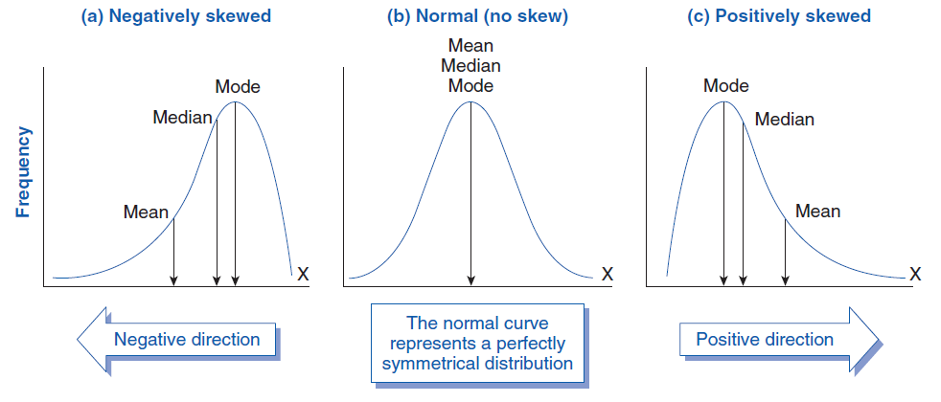
Source: https://www.biologyforlife.com/skew.html
Skewness is often measured using the coefficient of skewness, which is calculated as: (coefficient of skewness) = (3 * (mean - median)) / standard deviation. For example: Let’s consider a dataset with the following 9 data points: 2, 4, 4, 4, 6, 6, 6, 8, 10
Calculate the mean (μ) of the dataset: μ = (2 + 4 + 4 + 4 + 6 + 6 + 6 + 8 + 10) / 9 ≈ 5.33
Calculate the median of the dataset: Since the dataset is ordered, the median is the middle value: Median = 6
Calculate the standard deviation (σ) of the dataset: σ ≈ 2.29 (calculated using standard deviation formula)
Compute the skewness using the formula: Skewness = (3 * (mean - median)) / standard deviation Skewness = (3 * (5.33 - 6)) / 2.29 ≈ -0.88
If the coefficient of skewness is positive, the dataset is positively skewed, while if it is negative, the dataset is negatively skewed. If it is zero, the dataset is normally distributed. A rule of thumb states the following: • If skewness is less than −1 or greater than +1, the distribution is highly skewed. • If skewness is between −1 and −.5 or between +.5 and +1, the distribution is moderately skewed. • If skewness is between −.5 and +.5, the distribution is approximately symmetrical.
The skewness function in Excel is SKEW. For example, if you want to find the skewness of a range of numbers in cells A1 through A10, you would enter the formula “=SKEW(A1:A10)” in a cell.
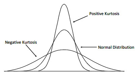
Kurtosis measures the degree to which a dataset is peaked or flat compared to a normal distribution. A distribution with a high kurtosis value has a sharp peak and fat tails, meaning there are more extreme values in the tails of the distribution. A distribution with a low kurtosis value has a flatter peak and thinner tails. The calculation is a little more complicated, so let’s save some space and rely on our programs to calculate it.
A normal distribution has a kurtosis of 3. If the coefficient of kurtosis is greater than 3, the dataset has positive kurtosis (more peaked), while if it is less than 3, the dataset has negative kurtosis (more flat).
In summary, skewness and kurtosis are measures that help describe the shape and distribution of a dataset. They provide additional information beyond measures of central tendency and variation. They are most often used to detect outliers. But they can also be an important feature of the data. For example the distribution of IPO returns is positively skewed, a very few IPOs have orders of magnitude larger returns than all the others. This is not so much an outlier but a feature nature of the process.
The kurtosis function in Excel is KURT. For example, if you want to find the kurtosis of a range of numbers in cells A1 through A10, you would enter the formula “=KURT(A1:A10)” in a cell. Note that Excel’s KURT function returns the excess kurtosis, which is the kurtosis minus 3. Therefore, to get the actual kurtosis value, you need to add 3 to the result of the KURT function.
Source: https://www.freecodecamp.org/news/skewness-and-kurtosis-in-statistics-explained/
As you can see from the figures, measures of central tendency and variation are typically related to visualizations such as histograms or scatters with lines and markers (additional options in Excel).
3.9.4 Outliers
Outliers are data points that are significantly different from the other data points in a dataset. As outliers can have a significant impact on the results of statistical tests and models, we would also like to briefly mention statistical techniques to identify such outliers.
The Z-score is a standardized measure that represents the number of standard deviations a data point is away from the mean of the dataset. A high absolute value of the Z-score indicates that the data point is far from the mean, which can be considered an outlier. To detect outliers using the Z-score method, follow these steps:
Calculate the mean (μ) and standard deviation (σ) of the dataset. Let’s consider a dataset with the following 10 data points: 23, 25, 26, 28, 29, 31, 32, 34, 50, 55 μ = (23 + 25 + 26 + 28 + 29 + 31 + 32 + 34 + 50 + 55) / 10 = 33.3 σ ≈ 9.68 (calculated using standard deviation formula)
Compute the Z-score for each data point using the formula: Z = (X - μ) / σ, where X is the data point. Z(23) ≈ (23 - 33.3) / 9.68 ≈ -1.06 … Z(55) ≈ (55 - 33.3) / 9.68 ≈ 2.24
Identify outliers based on a chosen threshold for the Z-score, usually |Z| > 2 or |Z| > 3. Using Z| > 2, data point 55 has a Z-score of 2.24, which is greater than 2, so it could be considered an outlier.
Using the Z-score method assumes that the data is normally distributed. Outliers are identified based on their distance from the mean in terms of standard deviations. However, this method can be sensitive to extreme values, which might affect the mean and standard deviation calculations.
The interquartile range (IQR) is a measure of statistical dispersion that represents the difference between the first quartile (Q1, 25th percentile) and the third quartile (Q3, 75th percentile) of the data. The IQR is less sensitive to extreme values than the mean and standard deviation, making it a more robust method for detecting outliers.
Calculate the first quartile (Q1) and the third quartile (Q3) of the dataset. Let’s consider a dataset with the following 10 data points: 23, 25, 26, 28, 29, 31, 32, 34, 50, 55 Q1 (25th percentile) = 26 Q3 (75th percentile) = 34
Compute the interquartile range (IQR) using the formula: IQR = Q3 - Q1. IQR = Q3 - Q1 = 34 - 26 = 8
Define the lower and upper bounds for outliers: Lower Bound = Q1 - k * IQR and Upper Bound = Q3 + k * IQR, where k is a constant (typically 1.5 or 3). Lower Bound = Q1 - k * IQR = 26 - 1.5 * 8 = 14 Upper Bound = Q3 + k * IQR = 34 + 1.5 * 8 = 46
Identify data points that fall below the lower bound or above the upper bound as outliers. Data points 50 and 55 are above the upper bound (46), so they can be considered outliers.
The IQR method does not rely on the assumption of a normal distribution and is more robust to extreme values than the Z-score method. However, it might not be as effective in detecting outliers in datasets with skewed distributions. Therefore, using multiple methods to detect outliers can give a more complete picture.
3.10 Correlation analysis
While correlations can be depicted visually, a correlation can also be quantified, expressing the strength and direction of the relationship between two variables. The most widely used correlation coefficient is the Pearson correlation coefficient, also known as Pearson’s r.
The Pearson correlation function in Excel is CORREL. For example, if you want to find the Pearson correlation coefficient between two variables in cells A2 through A20 and B2 through B20, you would enter the formula “=CORREL(A2:A20,B2:B20)” in a cell.
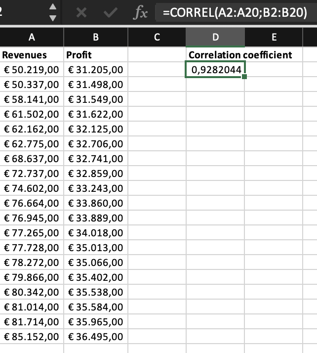
The correlation coefficient is a numerical value that ranges from -1 to +1. A correlation coefficient of -1 indicates a perfect negative correlation, where one variable increases as the other variable decreases. A correlation coefficient of +1 indicates a perfect positive correlation, where both variables increase or decrease together to the same extent. This may help, for example, in a situation where you have to decide between using two measures. Imagine you have to decide whether you want to use revenues or profit to proxy for firm performance. If these variables correlate (nearly) a 100%, it does not matter which variable you use all analysis outcomes will be the same. A correlation coefficient of 0 indicates no correlation between the variables. Furthermore, we use the following rule of thumb to describe the strength of a correlation (this rule might differ slightly across disciplines):
- r = 0: No linear relationship between the variables.
- 0 < |r| < 0.3: A weak or negligible linear relationship.
- 0.3 ≤ |r| < 0.5: A moderate linear relationship.
- 0.5 ≤ |r| < 0.7: A strong linear relationship.
- 0.7 ≤ |r| ≤ 1: A very strong linear relationship.
Correlations help identify relationships between variables that might not be readily apparent through visual inspection alone. By quantifying the relationship, correlations provide a more objective basis for understanding the associations between variables in a dataset. Further, correlations help business analysts to generate hypotheses about the underlying causes or drivers of the observed relationships. While some common knowledge or gut feeling may be useful to start with, we want to train how to use data to guide the analysis process. Insights from correlations help us to complement our personal views, and provide more structured evidence rather than gut feeling does. These preliminary hypotheses can then guide further investigation and advanced analysis. That is, although correlations do not imply causation, they can provide initial evidence for potential causal relationships between variables. By identifying strong correlations, researchers can prioritize further investigation into causal relationships, using methods such as controlled experiments, natural experiments, or more advanced statistical techniques like instrumental variables.
An example is the correlation between advertising spending and sales revenue. A company might want to know whether its advertising efforts is related to increased sales. To test this correlation, the company could collect data on its advertising spending and its sales revenue over a period of time, such as a quarter or a year. The company could then use the Pearson correlation coefficient to calculate the strength and direction of the correlation between the two variables. If there is a strong positive correlation between advertising spending and sales revenue, the company can conclude that advertising efforts and sales move together. On the other hand, if there is no or a weak correlation, the company may need to rethink its advertising strategy or explore other factors that may be affecting sales revenue.
Caution: again, as stated above, correlation is not causation (and never ever write in your exams, assignment, or reports that one variable affects/impacts/influences/or increases another variable when you refer to correlations :))! While advertising spending and sales might move in the same direction, this does not automatically imply that the increase in sales is caused by the increase in advertising spending. Consider the following famous example on the correlation between ice cream sales and drowning deaths. Both variables tend to increase during the summer months, leading to a correlation between the two. However, this correlation is spurious, as there is no causal relationship between the two variables. In reality, the correlation is likely driven by a third variable, such as warmer weather. Warmer weather may lead to increased ice cream sales, as people seek cold treats to cool down, and may also lead to increased swimming and water activities, which could increase the risk of drowning deaths. Therefore, while the correlation between ice cream sales and drowning deaths may seem to suggest a causal relationship, it is actually spurious and driven by a third variable.
An example of spurious correlation in the business context could be the correlation between heating expenses and sales numbers. While there may be some anecdotal evidence to suggest that a comfortable office temperature can improve employee productivity, that does not imply that there is a structural causal relationship between the two variables. If the business analyst were to find a correlation between heating expenses and sales, this would likely be spurious. The correlation may be due to a third variable, such as seasonality: in the winter, employees might be less likely to take holidays, which may imply longer presence at the office (which increases heating expenses) and simultaneously imply more working hours–hence the increase in sales. So we need to be cautious and avoid drawing causal conclusions based on a potentially spurious correlation. It is essential to carefully consider the underlying data and any potential confounding variables before making any changes to office temperature or other policies that may impact sales; more advanced econometric analyses are required to determine causality.