4 Diagnostic Analytics
4.1 Learning goals
- Critically evaluate whether a data pattern is meaningful or misleading.
- Understand how relations between business variables can arise through multiple pathways.
- Use mental models and causal diagrams to guide diagnostic analysis.
- Apply regression analysis thoughtfully to investigate “why” questions.
- Recognize key threats to credible interpretation (confounding, colliders, post-treatment bias).
4.2 What is diagnostic analysis?
Diagnostic analysis is a natural extension of exploratory analysis—the identification of data patterns (Chapter 3). In the previous section, we looked at descriptive / exploratory analysis (Chapter 3), essentially asking: “What patterns do we see in the data?”. Exploratory analysis tells us:
“Here is something interesting happening in the data.”
A data pattern is only the starting point, however. “Why did we observe this pattern?” is the obvious next questions. Diagnostic analysis deals with how to find possible answers to this and similar questions:
“What explains it?” “Which factors drove the outcome?” “Would this pattern change if we intervened or did something different?”
Importantly, these are causal questions. Causal questions are necessary to evaluate the outcome of decisions or to develop targeted strategies to improve some aspects of a business. Examples are:
- Why are some business units more profitable than others?
- Why did churn increase for a specific customer segment?
- Why did a pricing change not have the expected impact?
An important learning of this section is that causal conclusions require reasoning about mechanisms and drivers. We will see that this requires us to make some assumptions about the mechanisms. There is no way around that.
4.3 Diagnostic analysis requires mental models
A diagnostic analysis often requires more advanced statistical techniques than those used in exploratory analysis. Even more importantly, it requires a strong reliance on mental models. Mental models are required to design and interpret analyses that are able to speak to “why” questions.
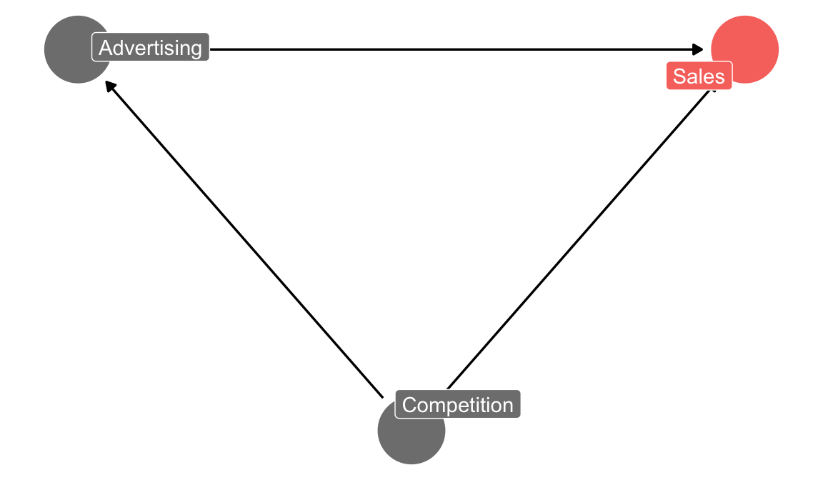
Suppose we have observational data on advertising campaigns our company ran and sales numbers for the following weeks. Suppose the data shows no discernible pattern. Can you conclude that advertising had no effect on sales? No. This is just a correlation. Suppose your mental model includes the assumption that competitors’ advertising efforts have an adverse affect on our sales. You also surmize that our marketing department often reacts to competitor advertising campaings by also increasing our own advertising efforts.
If that mental model is correct, then one reason for not seeing a correlation between our advertising efforts and sales is because there is a counterveiling force. Our advertising is partly driven by competitors efforts. When competitors advertise more, our sales go down (negative effect), but at the same time our advertising goes up (positive effect). The our efforts and the competitor effect cancel each other out in the data. Thus, no correlation is observed. That is good news and bad news. Good news, because it suggests that not all is lost. Our advertising might still have a positive effect. The bad news is that we won’t find out unless we find data on competitor advertising. In addition we just learned that conclusions that we can draw from data are to some extent subjective: They depend on a mental model on the unobservable dynamics behind the data.
Whether a mental model is correct is always somewhat unverifiable. In this case, a competitive channel is not implausible. The first argument (competitor advertising ->(-) our sales) is an essentially unverifiable assumption in this setting. The second argument (competitor advertising ->(+) our advertising) you could try to verify somewhat by reaching out to marketing. But the overall model will rest to some extent on assumptions.
4.4 Developing a mental model

Source: Schaffernicht (2017)
Mental model is our term for a simple representation of the unobserved dynamics between variables of interest. A mental model represents how different elements in a system influence each other. In the context of business decisions, mental models help decision-makers describe their ex-ante beliefs about complex dynamics and make more informed decisions.
When developing a mental model, it is important to first have isolated the question of interest. E.g., our question(s) of interest could be: “Why is customer churn increasing? Is it because of our price being to high versus competitors?””
For causal analysis we want to get to the point of expressing a causal question in terms of an expected relation between variables. E.g., “Is customer churn positively associated with price, when holding other factors fixed?” Holding other factors fixed is important, because otherwise we cannot isolate the effect of price on churn. More on that later. Nearly all these questions can be expressed in the form of an arrow between an outcome (\(Y\), customer churn) and a variable of interest (\(X\), price).
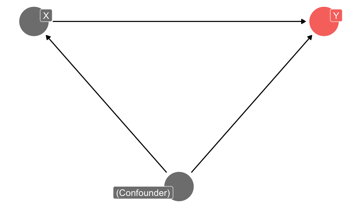
The rest of the mental model then describes the other variables that influence \(Y\) and \(X\) and how they are related to each other. Let us imagine the example of customer churn in a subscription-based business. The first step in developing a mental model involves identifying the key variables that are relevant to either \(Y\) (the outcome) or \(X\) (the variable of interest). The reason is that for causal analysis, we need to rule out “alternative explanations” for seeing a correlation between \(Y\) and \(X\). Such alternative explanations arise from so-called confounding variables (counfounders). Confounders are variables that cause both the outcome and the variable of interest. Either directly, or indirectly. In the sales example, above, competition was such a confounder. Depending on our mental model, there might be several confounders for customer churn and price. The best way to find them is to think about the business context and the mechanisms that drive either customer churn or price. Often, one variable has less determinants than the other one. Or is easier to reason about. Start with that variable. In our customer churn example, it is probably easier to reason about the determinants of customer churn than about the determinants of price. These determinants might include factors such as product quality, quality of customer support, pricing, and competitor offerings. This step of first identifying key determinants is essential, because it helps you focus the analysis on the most relevant factors. The more expert knowledge we have in an area, the more we can already resort to our experience to build mental models. Still, do not forget to reason about variables and patterns uncovered via the preceeding exploratory analysis. Often new insights were generated at that step.
Describe the nature of the relations between the variables. We encourage you to draw a diagram. A visual representation of your mental model is often a great help for organizing your thoughts, critically analyzing then, and communicating them to others. The example below illustrates the point that text only may not be enough:
Let’s go back to our customer churn example. With regard to our key variable of interest, customer churn, we could hypothesize the following:
Quality of customer support is negatively associated with customer churn (because better customer support quality makes customers happy, and they are less likely to leave).
Product quality is negatively associated with customer churn (because higher product quality makes customers happy, and they are less likely to leave).
Competitor offerings are positively associated with customer churn (because interesting offers from competitors might trigger our customers to switch to our competitors).
Price is positively associated with customer churn (because customers do not like to pay more, and they are more likely to leave).
Product quality is positively associated with price (because higher quality is usually costly, sales prices need to be higher as well).
Competitor offerings are negatively associated with price (because of the pressure in the market and the offer by our competitors, we might need to reduce our prices).
It is easy to loose the bigger picture and a quick sketch makes our reasoning much more transparent:
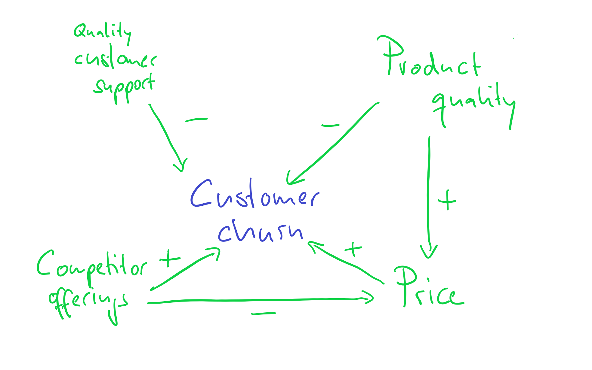
As we will see in examples later, without first establishing such a structure, we would basically interpret correlations blindly and at great peril.
And now you are ready to test your mental model against real-world data and observations to ensure its accuracy and relevance. The sketch (as we will explain later) also already tells you that you cannot analyze the relation between churn and price without holding the influence of product quality and competitor offerings fixed! Something that our analysis of a price effect will need to be able to do, if your theory is correct. Again, having clarity about the mental model is essential as basis for any decisions you want to make. Without a clear idea of why certain variables are associated, you will not be able to interpret any results that your analyses will provide you.
Developing a mental model is an iterative process, where the model is continuously refined based on the insights gained from the analysis. As new relations and factors are identified, the mental model can be updated to better represent the true underlying structure of the data. As new information emerges or the business environment changes, update your mental model to reflect these developments. This iterative process allows for a deeper understanding of the factors influencing, for example, customer churn and more effective decision-making regarding this issue.
4.5 Four causal roles to recognize
In addition to confounders, there are other types of nodes in a causal graph: Mediators, Colliders, and Moderators. Each has a distinct causal role. Recognizing the role of important variables in your DAG is a simple discipline that keeps those assumptions front and center. We will introduce each based on the example of an online retailer. Assume we are interest in whether an email campaign (promotion intensity) caused higher revenues.
4.5.1 Confounders: shared causes we must block
Confounders influence both the driver we care about and the outcome. Holiday demand spikes, for example, lead marketing to send more email offers and independently boost invoice revenue. If we regress order value only on basket size, we understate the role of promotions or pricing because seasonality is doing part of the work.
confounder_dag <- dagify(
  order_value ~ promo_intensity + holiday_demand,
  promo_intensity ~ holiday_demand,
  outcome = "order_value",
  exposure = "promo_intensity",
  labels = c(
    order_value = "Invoice revenue",
    promo_intensity = "Email campaign",
    holiday_demand = "Holiday demand"
  ),
  coords = list(
    x = c(order_value = 3, promo_intensity = 1.7, holiday_demand = 0.5),
    y = c(order_value = 1, promo_intensity = 0, holiday_demand = 1)
  )
)

mediator_dag <- dagify(
  order_value ~ basket_mix,
  basket_mix ~ promo_intensity,
  outcome = "order_value",
  exposure = "promo_intensity",
  labels = c(
    order_value = "Invoice revenue",
    promo_intensity = "Email campaign",
    basket_mix = "Basket mix"
  ),
  coords = list(
    x = c(order_value = 3, basket_mix = 2, promo_intensity = 1),
    y = c(order_value = 1, basket_mix = 1.2, promo_intensity = 0)
  )
)

collider_dag <- dagify(
  stockout ~ supplier_delay + flash_sale,
  labels = c(
    stockout = "Stockouts",
    supplier_delay = "Supplier delay",
    flash_sale = "Flash sale"
  ),
  coords = list(
    x = c(supplier_delay = 1, stockout = 2, flash_sale = 3),
    y = c(supplier_delay = 1, stockout = 0, flash_sale = 1)
  )
)

plot_role <- function(dag_obj, title) {
  ggdag(dag_obj, use_labels = "label", text = FALSE) +
    theme_dag() +
    labs(title = title) +
    guides(fill = "none", color = "none")
}

(plot_role(confounder_dag, "Confounder") | plot_role(mediator_dag, "Mediator")) /
  plot_role(collider_dag, "Collider")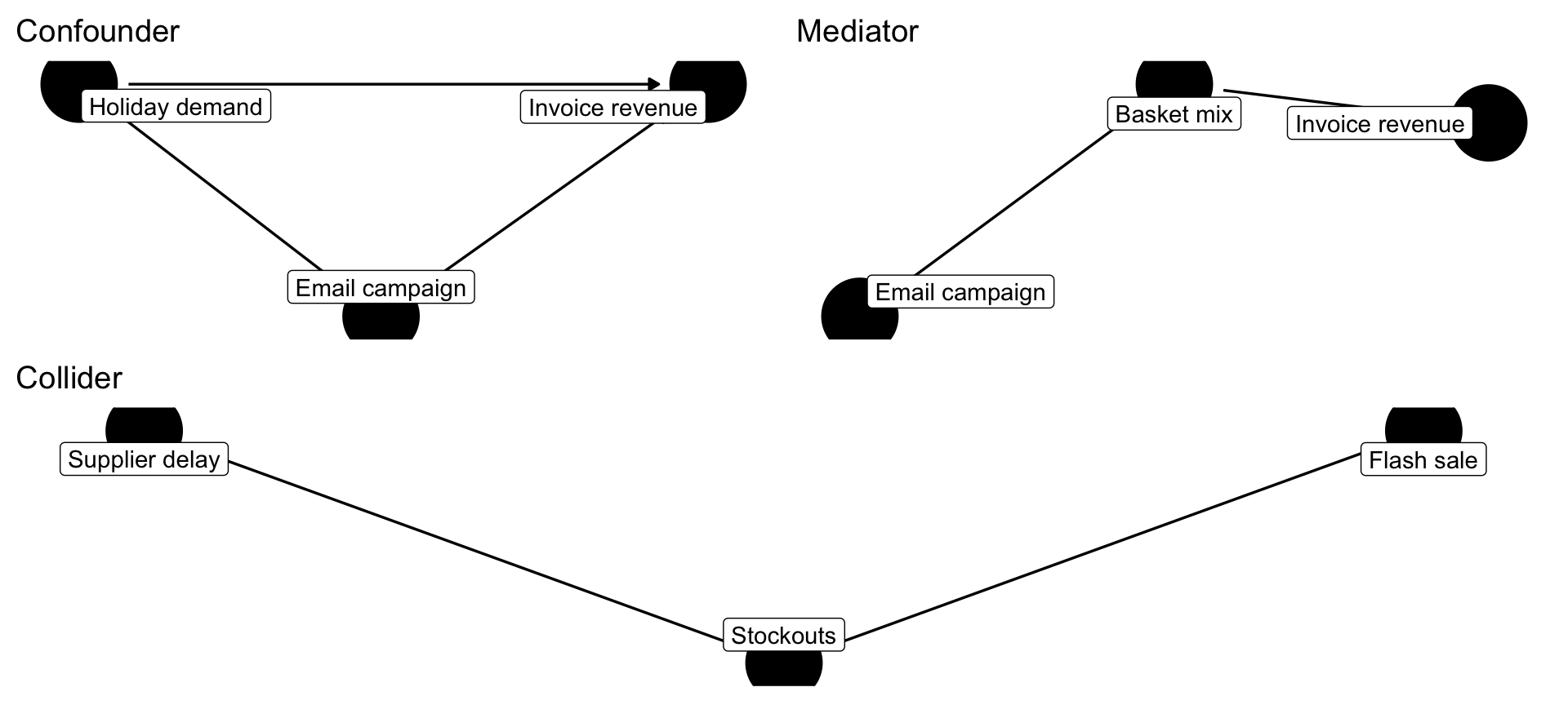
To see the bias numerically, compare two simple regressions. The first regresses invoice value on the number of items alone; the second conditions on the number of SKUs and the average unit price so that we separate “more items because it is December” from “more items because of a discount.”
The “Simple” specification naively states that every additional item adds about £0.79 to invoice value. Once we control for how many SKUs were in the basket and how expensive those items were, the marginal contribution of an extra unit rises slightly to £0.79. The difference may look small numerically, but the key point is methodological: without putting all known confounders in the model, we cannot tell whether items or item mix explain the higher order value.
4.5.2 Mediators: mechanisms we may or may not want to open
The mediator sits on the path from a driver to the outcome. In the retailer case, the email campaign nudges customers to explore more categories (basket_mix), which in turn raises order value. Whether you control for the mediator depends on the question: if you want the total impact of the campaign, do not adjust for the mediator. If you want to isolate the indirect effect through basket mix, you must model it. Mediators are great storytelling devices (“the campaign worked because baskets contained two more SKUs than usual”), but conditioning on them when estimating total effects can induces what is called “post-treatment bias”. And the reason for that bias has to do with colliders, which we discuss next.
4.5.3 Colliders: variables we should leave alone
Colliders—two arrows pointing into the node—are dangerous because conditioning on them creates spurious associations. Imagine we only look at orders that ended in a stockout. Among those orders, supplier delays and flash sales suddenly appear negatively related even though there is no true causal link between them. This is a trap. Data alone cannot reveal the true process if you open the wrong gate.
4.5.4 Moderators: interactions that tilt slopes
Moderators change the strength of a relationship. A discount might drive large incremental revenue for international customers but barely move UK regulars. In regression terms we capture moderators with interactions. The code below estimates whether the unit-price effect differs for UK invoices after controlling for basket size. The interaction term is roughly £134, meaning the slope between price and revenue is steeper for UK shoppers.
invoice_summary <- invoice_summary |>
  mutate(uk_customer = Country == "United Kingdom")

moderator_model <- lm(order_value ~ avg_unit_price * uk_customer + total_items, data = invoice_summary)

broom::tidy(moderator_model, conf.int = TRUE) |>
  filter(term %in% c("avg_unit_price", "avg_unit_price:uk_customerTRUE")) |>
  mutate(across(c(estimate, std.error, conf.low, conf.high), round, 2)) |>
  select(term, estimate, std.error, conf.low, conf.high) |>
  mutate(term = recode(term,
                       "avg_unit_price" = "Avg. unit price (non-UK)",
                       "avg_unit_price:uk_customerTRUE" = "Interaction: price × UK")) |>
  gt() |>
  fmt_currency(columns = c(estimate, conf.low, conf.high), currency = "GBP") |>
fmt_number(columns = std.error, decimals = 2)| term | estimate | std.error | conf.low | conf.high |
|---|---|---|---|---|
Explicitly labelling variables by these roles keeps our causal ladder intact: we block confounders, respect mediators, avoid colliders, and test moderators. The rest of the chapter keeps referring to the online retailer case so you can see how each statistical tool supports that mental model.
4.6 There is no such thing as chance
Before diving into the details of analyzing why questions, we need to clarify some basics. You might have heard phrases like: “This relation between x and y is unlikely due to chance”. What this means, is that the analyst believes the pattern observed in the data between x and y would also be present in general and not just in this particular data set. That it is generalizable. But how could “chance” (or “noise”) even create a pattern? What does this mean?
To understand what is actually meant by randomness or chance in our context, think of a coin flip. We usually assume the chance of a coin landing heads or tails to be even (50% it lands heads and 50% it lands tails). We often say: the chance of a coin landing heads or tails is purely random. Notice though, that randomness here is a statement about our ignorance, not a property of the universe. We know the physics of a coin flip quite well. If we could measure the angle of the coin flip, the wind around the coin, the distance to ground, etc. We could combine our knowledge with the measure to built a prediction model and estimate the probability of the coin landing heads. We would very likely do much better than 50%. Randomness is thus simple due to the fact that either, we have not measured all determinants of the outcome (e.g., coin lands heads), or we do not even know enough about the problem to specify the determinants with certainty (a mental model question). In regression models, all the unmeasured and unmodelled influence are packed into what is called an error term. The following is a typical regression equation, specifying a linear relation between \(y\) and \(x\):
\[y = 1 + 2 * x + u\]
The \(u\) is the error term. It captures all the other things that also influence \(y\) and which we didn’t care to model and measure explicitly. The fact that there will be always an error term—we can never hope to name and measure all influences of even simple problems—is the source of “chance” patterns.
The following simulation tries to illustrate the issue. We draw 50 x variables at random. Its values are:
[1] -6.81405021 0.29080315 -16.64506129 -16.93622258 -19.55388221
[6] 27.82578770 -2.12722250 -4.42818912 6.06723243 -4.86329299
[11] -12.99773334 3.66039111 -15.46757532 0.15252543 -0.47744402
[16] -3.97635456 -5.01853836 -21.89194429 -4.70215525 5.51044371
[21] -1.93933150 4.45463912 -0.39409296 18.12015075 -20.29820415
[26] -5.13356070 -5.03222157 2.08585323 -9.37122698 -12.85983170
[31] -4.86984684 3.48049542 -0.02823887 7.00464237 -17.87917138
[36] -4.87859963 -7.17129903 10.38264712 -18.20612595 17.46602851
[41] 8.98895014 13.38321090 -16.12558303 -1.94650403 4.71490692
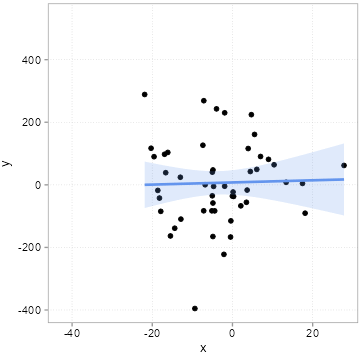
[46] 3.92105297 -7.14457750 -7.37191957 -18.61520235 -14.39777436We then we draw some other influences at random, pack them into an error term \(u\) and compute a \(y\) variable according to the equation above \(y = 1 + 2 * x + u\). We do this 20 times, but we always use the same \(x\) values above. Importantly, this means that the true slope for all 20 samples is 2. If you need an example, think of 20 surveys where each time 50 people were surveyed about how happy they are (\(y\) = happiness). The survey firm tried very hard to always get the same \(x\) distribution (say x is age of the respondents), but it can obviously never find exactly the same type of people. Because people of the same age are still very different, the error term \(u\) will always differ quite a bit among these 20 surveys. Figure 4.6 shows how much the sample relation (the slope) between x and y varies between the 20 surveys:
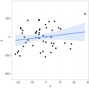
Remember the slope underlying the relation between x and y for all 20 samples is 2! All the variation you see here in slope (some are even negative!) is due to the unmeasured influences in \(u\). Remember we always used the same x values. If you pay careful attention, you can see that the dots in the plot only move up and down. The \(x\) values are fixed. It is thus the changing amounts of \(u\) that are added to x to arrive a \(y\) that camouflage the true relation. This is what people mean when they say a relation can be due to chance.
The “chance” of chance patterns is thus higher when there is a lot of unexplained variation of the outcome of interest left. The best remedy against this is: more data. In Figure 4.7, we start with a sample of 50 observations and increase it step by step by 10 observations up to a maximum of 500 observations.
Note how the regression line becomes more and more certain what the relation could be (it slowly converges to 2).
Let’s consider an example from the business world to illustrate again what to look out for. Suppose you are a sales manager at a retail company and you want to determine if sales performance varies significantly between two groups of sales representatives: those who work weekdays (Group A) and those who work weekends (Group B). After analyzing the data, you find that Group B had, on average, 20% higher sales than Group A. However, you need to determine if this difference is due to the different work schedules or if it could have occurred by chance. Given all the other influences that might determine sales, it is probably not unreasonable to be skeptical that this pattern might be related just to differences in people. We thus need some protocol or workflow to decide how to interpret this pattern. One such workflow are classical statistical hypothesis tests, which we discuss next.
4.7 Hypothesis testing
Hypothesis testing operationalizes the “chance vs. signal” question you just saw in Figure 4.6. Hypothesis testing is a decision-making workflow: we explicitly state what “no effect” would look like, quantify how surprising our sample is under that view, and then decide whether to keep or reject the null story.
Formal hypothesis testing treats the “true” coefficient on \(x\) as an unknown population parameter. The null hypothesis \(H_0\) says “The true coefficient on \(x\) is zero.” The alternative \(H_A\) says “It is not zero.” The logic mirrors Figure 4.6: if there is a lot of unexplained variance (e.g., customers are quirky! If observations are customers), a coefficient 1 is not surprising and we fail to reject \(H_0\). If the gap is too large to be explained by noise, we reject \(H_0\) and start thinking about root causes.
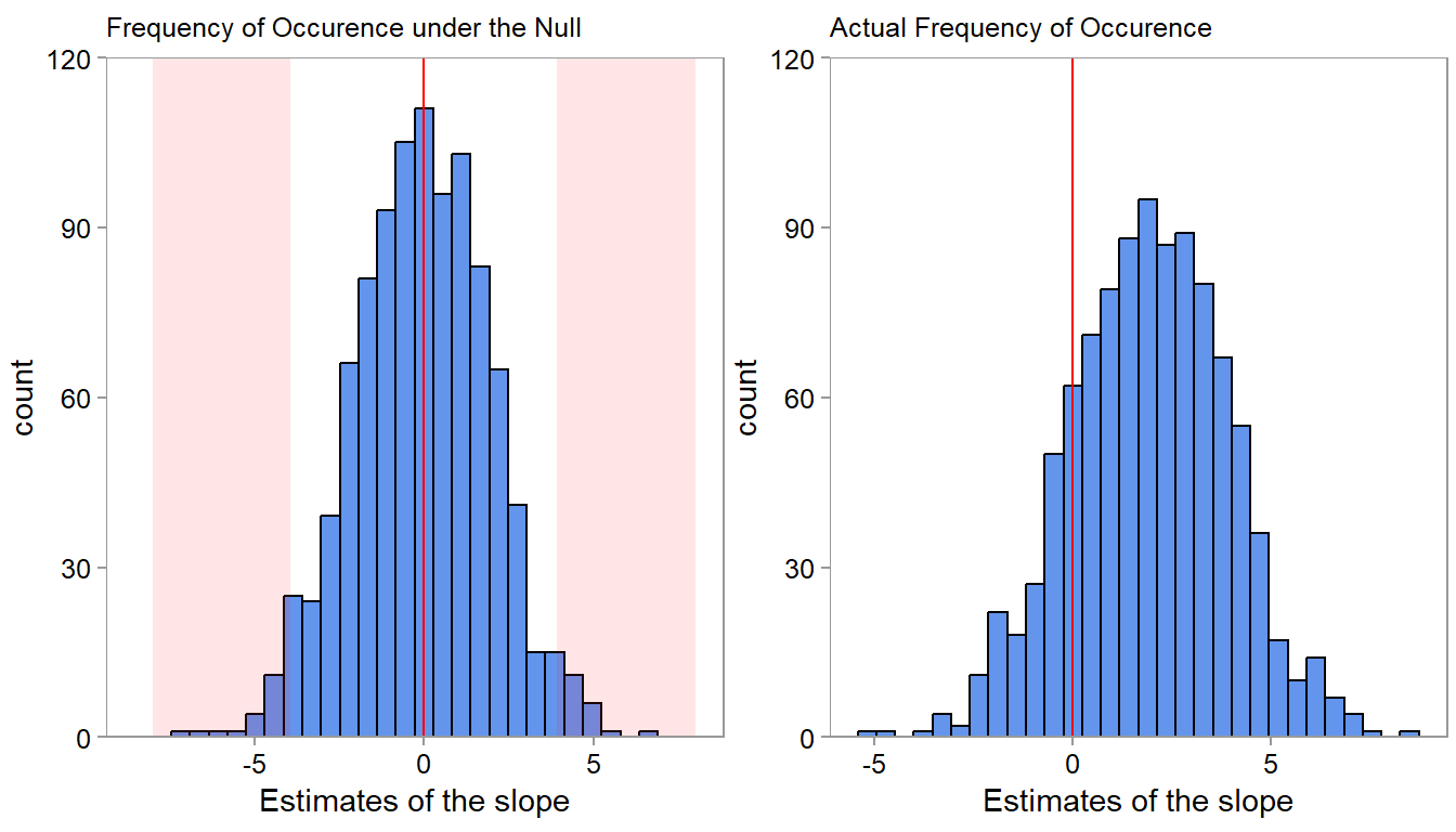
If you look at the left plot, the chance of observing a slope of +/- 0.3 is quite high if the slope would be zero. We would observe a lot of counts in this range if \(H_0\) were true. When seeing a 0.3 slope, we would thus not reject \(H_0\). But, because we simulated the data, we know that it would be mistake to conclude that the pattern is due to chance—the true slope is 2. This mental check prevents us from “over-interpreting” the sample or “under-reacting” to real effects.
A p-value and significance level quantify this reasoning. The significance level \(\alpha\) is the error rate we are willing to tolerate when wrongly rejecting \(H_0\). The p-value is the probability of seeing a result at least as extreme as ours if \(H_0\) were true.
In summary, the general steps involved in hypothesis testing thus are:
Formulate the null and alternative hypotheses: Clearly state the null hypothesis (H\(_0\)). The alternative H\(_A\) is usually that that the population parameter is not equal to the population parameter. For example, H\(_0\): There is no difference in sales performance of weekday- and weekend-workers. H\(_A\): There is a difference in sales performance of weekday- and weekend-workers. There are also of course, directional hypotheses, such as the population parameter is greater than 0. The same logic applies to them.
Choose an appropriate significance level (\(α\)): It is the error level we allow ourselves; the point at which we say, values that occur with a probability of \(a\) or less we consider to not arise from H\(_0\). A common choice for \(α\) is 0.05, indicating a 5%. But that number is to some extent ad-hoc. Think carefully about what it should be in your application.
Select a suitable statistical test: Depending on the research question, data type, and assumptions, choose a statistical test (e.g., t-test, chi-square test, ANOVA) to analyze the data. We have not talked much about this yet. We will talk more about it in the exercises.
Calculate the test statistic and p-value: Apply the selected statistical test to the sample data and calculate the test statistic and corresponding p-value. Let’s say we find a p-value of 0.02. This means that there is only a 2% probability of observing a difference as large as the one we found (or larger) if the null hypothesis were true (i.e., if there was no real relation between the work schedule and sales performance).
Compare the p-value to the chosen significance level (\(α\)): If the p-value is less than or equal to \(α\), reject the null hypothesis in favor of the alternative hypothesis. If the p-value is greater than \(α\), fail to reject the null hypothesis, meaning there is not enough evidence in the data to rule out H\(_0\). Note: When you cannot reject H\(_0\) it does not mean that H\(_0\) is true! It simply means, we cannot rule it out. Absence of evidence is not the same as evidence of absence.
4.8 The Regression framework
We basically introduced half of what a regression analysis is about already in the preceding two sections. Regression analysis is a statistical method used to model the relationship between a dependent (response) variable and one or more independent (predictor) variables. It is an incredibly powerful tool in any data analysts toolbox. In addition, it provides a great teaching aid where we can introduce may important concepts that generalize to all other analysis settings. To do so we start with the difference between correlation coefficients and coefficients in a regression model.
4.8.1 Revisiting correlations
In Chapter 3, we touched upon correlations. A correlation coefficient only assesses the strength of an assumed linear relationship in a sample—how linear it is. It does not tell us anything about the magnitude of the relation. If we want to learn something about the magnitude of the linear relation—and maybe compare it to the magnitude in other settings or other variables, we need a regression model.
To illustrate, we use an example of a retail company that analyzes the performance of its employees at each branch. The company wants to understand if there is a correlation between average employee tenure at the branch level and the branch profit they generate.1 The company collected data on the number of months an employee works for a branch and the total profit of the respective branch. We start our analysis by calculating the correlation coefficient between these two variables. We are first interested in the strength and direction of a possible linear relationship. Similarly to earlier, we would have two competing hypotheses:
H\(_0\): There is no significant association between employee tenure and profit
H\(_A\): There is a significant association between employee tenure and profit
To determine whether this correlation is “not by chance,” the company could perform a statistical test to determine if the observed correlation coefficient is statistically significant (using the correlation:: R package).
correlation(d4[, c("profit", "employee_tenure")])| Parameter1 | Parameter2 | r | CI | CI_low | CI_high | t | df_error | p | Method | n_Obs |
|---|---|---|---|---|---|---|---|---|---|---|
| profit | employee_tenure | 0.2576789 | 0.95 | 0.0326251 | 0.4578634 | 2.278555 | 73 | 0.0256203 | Pearson correlation | 75 |
This test would compare the observed correlation against what would be expected if there were no relationship between the two variables (i.e., the correlation is purely random). We can again use a t-test.2 The results present a correlation coefficient of 0.26 and a p-value of 0.026. This implies there is indeed a weak positive correlation (r = 0.26) which is significant (p-value of 0.026 is smaller than the conventional significance level (α) of 0.10 - in the accounting discipline).
All the correlation coefficient tells us, however, is that there is an indication of a linear relation, not the magnitude of the relation (see this wikipedia graph). If we are interested in that, we need to think about a regression model.
4.8.2 Regression coefficients
A regression expresses relations between an outcome \(y\) (also sometimes called response or dependent variable) and one or more predictor variables \(x\) (also sometimes called independent variable). For continuity with our running example we will contrast the branch-level Store24 data with the invoice-level online retailer data. Both let us discuss slopes, intercepts, and mental model alignment, yet the contexts appeal to different managerial questions: “How much profit per extra month of tenure?” vs. “How much revenue per extra item or per extra SKU?”
\[y = a + b * x + u\]
A regression coefficient \(b\) represents the estimated change in the dependent variable \(y\) associated with a one-unit change in an independent variable, holding all other independent variables constant. In other words, it quantifies not the direction of the relationship between the independent variable and the dependent variable, but also its magnitude in unit-changes. For example, a positive coefficient indicates a positive relationship, whereas a negative coefficient suggests an negative relationship.
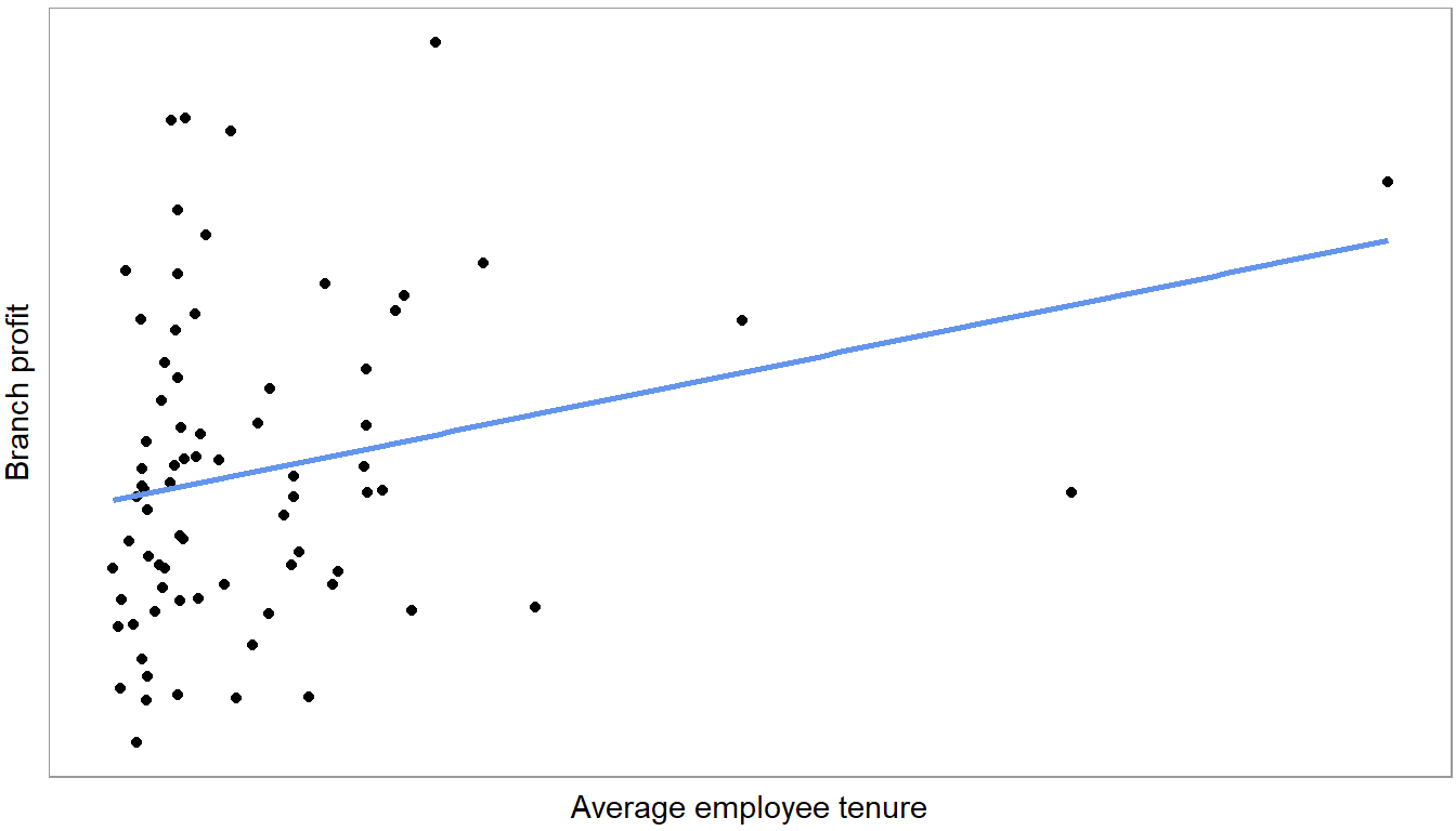
Figure 4.9 plots a regression line. It shows the slope of the following linear equation:
\[Profit = a + b * employee\_tenure + u\]
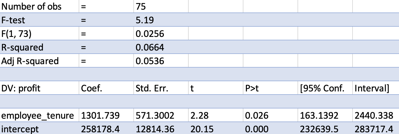
Most data tools these days allow you to estimate regressions. Figure 4.10 shows regression output, estimating the line above, for a random sample of branches using excel. Below you find R output (using the jtools:: summ function because it creates cleaner summaries).
#| label: tbl-slope-comparison #| tbl-cap: “Comparing slopes in two business contexts”
m1 <- lm(profit ~ employee_tenure, data = d4)
summ(m1, confint = TRUE)
MODEL INFO:
Observations: 75
Dependent Variable: profit
Type: OLS linear regression
MODEL FIT:
F(1,73) = 5.19, p = 0.03
R² = 0.07
Adj. R² = 0.05
Standard errors:OLS
-------------------------------------------------------------------------
Est. 2.5% 97.5% t val. p
--------------------- ----------- ----------- ----------- -------- ------
(Intercept) 258178.44 232639.45 283717.43 20.15 0.00
employee_tenure 1301.74 163.14 2440.34 2.28 0.03
-------------------------------------------------------------------------m_retail <- lm(order_value ~ total_items, data = invoice_summary)
summ(m_retail, confint = TRUE)MODEL INFO:
Observations: 40078
Dependent Variable: order_value
Type: OLS linear regression
MODEL FIT:
F(1,40076) = 25665.53, p = 0.00
R² = 0.39
Adj. R² = 0.39
Standard errors:OLS
------------------------------------------------------------
Est. 2.5% 97.5% t val. p
----------------- -------- -------- -------- -------- ------
(Intercept) 298.23 286.31 310.15 49.03 0.00
total_items 0.79 0.78 0.80 160.20 0.00
------------------------------------------------------------The row labeled employee_tenure contains the slope, the \(b\) of the regression model above. It is the parameter of interest here. First, note that the t-value and p value in this row are the same as that of the correlation coefficient. That is true for a simple linear regression with just one variable. The coefficient itself has value of 1,301.7. It is a measure of magnitude. It means that one additional month of average employee tenure is associated with 1,301.7 euros more in branch profits. This is the slope of the line in Figure 4.9. Do not be too excited about the magnitude however. Looking at the confidence interval, we can see that there is a lot of uncertainty about the actual magnitude (The 95% range is from 163 to 2,440). 1,301 is the best guess, but not a great guess. The invoice regression shows a comparable logic: one additional item in the cart is associated with roughly £0.79 extra revenue, but the 95% interval still spans roughly £0.78 to £0.80 because we have thousands of invoices.
The intercept (also known as the constant or the y-intercept) is the value of the dependent variable when all independent variables are equal to zero. It simply represents the point where the line intercepts with the y axis and usually does not have an interesting interpretation. In this case for example, do we really care that of a branch with an average tenure of zero months, the average profits are 258K euros?
Another feature of fitted regressions is that one can use them for (linear) predictions. If you want to make a prediction about the change in branch profits for let’s say a branch with an average employee tenure of 12 months, we simply use the regression formula and plug in the estimated coefficients: 1,301 * 12 + 258,178 = 273,790, i.e., the predicted incremental profit after 12 months is 15,612 Euros
4.8.3 Isolating associations via multiple regressions
The real use case for linear regression models is not assessing the magnitude of one single variable. For causal (diagnostic) analysis, it is the ability to estimate a linear association between the outcome \(y\) and a variable of interest \(x\) while holding the influence of other variables (sometimes called covariates) fixed. This is the domain of multiple linear regression analysis. It is a straight-forward expansion of the one-variable case.
\[y = a + b_1 * x_1 + b_2*x_2 + b_3 * x_3 + ... + u\]
We will focus on the reasons for including multiple \(x\) variables into regression for diagnostic purposes and cover the prediction case in the next Chapter 5. Generally, there are two reasons for why we would want to include a variable into a regression for diagnostic purposes:
Getting rid of confounding influences. If two variables \(x_1\) and \(x_2\) are related and we want to isolate the association of one with \(y\) while holding the other one fixed.
Increase precision. If we take out unmeasured causes of \(Y\) out of the error term we improve the precision of our coefficient estimates. Remember from Figure 4.6 that regression slopes bounce around more from sample to sample (are less precisely estimated), if there is a lot of unmeasured influences left in the error term. Including big determinants of \(y\) into the regression takes them out of \(u\) and thus helps against this.3
Why would one do either of these two steps for diagnostic purposes is best explained by example. Put yourself into the shoes of a business controller at a retail store chain and doing some exploratory analysis you notice that there is considerable variation in retail store performance in a certain region. You want to figure out the reason for that (diagnostic analysis).
Before you start throwing data at a regression, you do the smart thing and first come up with a first mental model of what should drive store revenues. It looks like this:
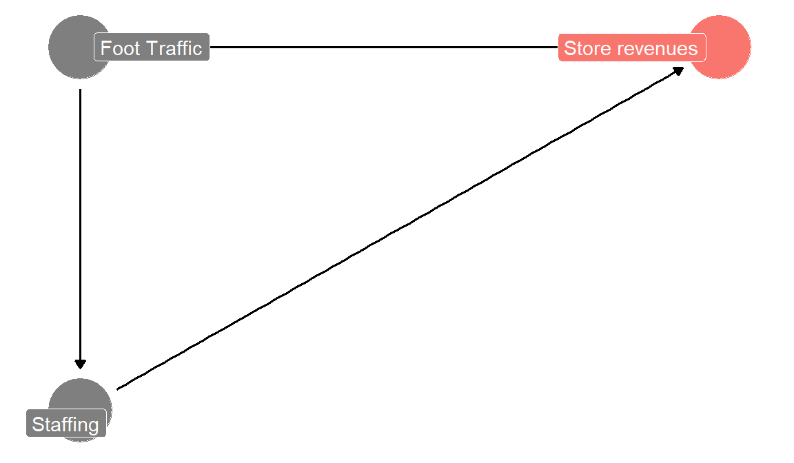
Your data (stored in a data.frame called d5) looks like this:
| StoreID | foot_traffic | sick_calls | staff | revenues |
|---|---|---|---|---|
| 1 | 143 | 1 | 4 | 31839 |
| 2 | 216 | 2 | 8 | 48804 |
| 3 | 78 | 4 | 1 | 17631 |
| 4 | 184 | 4 | 6 | 41208 |
| 5 | 214 | 2 | 7 | 48516 |
| 6 | 214 | 1 | 9 | 48747 |
revenues is weekly revenues, foot traffic is the number of customers per week. sick calls is how many employees called in sick that week. staff is how much sales personnel was working (not sick) during the week. You think that for your shops the amount of staff is important. But you also know that if a store is busier, you staff more sales personnel. So there is a direct connection. Just looking at the relation between revenues and amount of staff will thus be contaminated by foot traffic. The coefficient might just pick up that stores with more staff are busier stores. You want to know what the importance of staff is, holding foot traffic (how busy the store is) fixed. Stated another way, foot traffic is a confounding variable for estimating the relation between number of staff and revenues. You can see that in Figure 4.11. According to your mental model, foot traffic has an arrow going into revenues and an arrow going into staff. It causally influences both you think. Thus you need to hold its influence constant to have a chance to estimate the direct arrow going from staff to revenues. Multiple regression is one approach to do so.
Here is what would happen if we would ignore the confounding influence of foot traffic. We first estimate a simple regression of store revenues on number of staff working.
m2 <- lm(revenues ~ staff, data = d5)
summ(m2, confint = TRUE)
MODEL INFO:
Observations: 28
Dependent Variable: revenues
Type: OLS linear regression
MODEL FIT:
F(1,26) = 13.79, p = 0.00
R² = 0.35
Adj. R² = 0.32
Standard errors:OLS
-----------------------------------------------------------------
Est. 2.5% 97.5% t val. p
----------------- ---------- --------- ---------- -------- ------
(Intercept) 19774.52 9653.48 29895.56 4.02 0.00
staff 2604.77 1163.11 4046.44 3.71 0.00
-----------------------------------------------------------------We see a large and significant coefficient on staff working. One more staff working in that week is associated with 2.605 weekly revenues on average. However, your mental model in Figure 4.11 suggests that this number is incorrect. The number of staff is itself determined by foot traffic, so the 2,605 is likely partially driven by stores with higher foot traffic. We put foot traffic itself into the regression now.
m3 <- lm(revenues ~ staff + foot_traffic, data = d5)
summ(m3, confint = TRUE)
MODEL INFO:
Observations: 28
Dependent Variable: revenues
Type: OLS linear regression
MODEL FIT:
F(2,25) = 17526.33, p = 0.00
R² = 1.00
Adj. R² = 1.00
Standard errors:OLS
--------------------------------------------------------------
Est. 2.5% 97.5% t val. p
------------------ -------- -------- --------- -------- ------
(Intercept) 761.44 332.92 1189.97 3.66 0.00
staff 352.95 295.45 410.45 12.64 0.00
foot_traffic 209.98 207.12 212.84 151.31 0.00
--------------------------------------------------------------All of a sudden the coefficient drops down dramatically to €352 weekly revenues per staff member. This change is as expected if foot traffic is indeed a confounding influence for the staff variable.4
The main takeaway here is: one big advantage of multiple regression is that it allows you to examine the role and magnitude of individual determinants while holding others fixed. As we saw in this example, it can really matter to do so. If we would not have included foot traffic, we might have gotten the impression that staff members are way more important to store performance than they really are.
But notice, we made the judgment call to include foot traffic based on a mental model. Repeating our call from above, we need mental models to know which variables to include and when not. Notice for example that we have a variable called sick_calls in our dataset. what happens if we include this variable into the our regression model:
m4 <- lm(revenues ~ staff + foot_traffic + sick_calls, data = d5)
summ(m4, confint = TRUE)
MODEL INFO:
Observations: 28
Dependent Variable: revenues
Type: OLS linear regression
MODEL FIT:
F(3,24) = 11217.80, p = 0.00
R² = 1.00
Adj. R² = 1.00
Standard errors:OLS
---------------------------------------------------------------
Est. 2.5% 97.5% t val. p
------------------ -------- --------- --------- -------- ------
(Intercept) 755.95 250.81 1261.08 3.09 0.01
staff 353.42 290.76 416.09 11.64 0.00
foot_traffic 209.97 206.98 212.95 145.11 0.00
sick_calls 2.58 -115.25 120.41 0.05 0.96
---------------------------------------------------------------Things barely change. But that doesn’t mean that sick calls do not have an influence. They do! they reduce the number of staff working in that week and thus affect revenues. But, controlling for staff working, sick calls cannot affect revenues anymore! Your mental model tells you that including this variable into the regression does not add anything. This is a benign example, in some cases adding a variable can distort all the other variables’ coefficients. All of this is to say that we need strong theory and mental models to analyse determinants.
4.8.4 Some terms to know
Let’s now also take a closer look at some other information in typical regression tables.
Standard errors measure the variability or dispersion of the estimated coefficients (remember Figure 4.6). They provide an indication of how precise the estimated coefficients are. Smaller standard errors imply that the coefficients are estimated with greater precision and are more reliable, whereas larger standard errors suggest less precise estimates and more uncertainty. And uncertainty is something we need to live with as we are only estimating the coefficient of a sample.
The T statistics (t) are calculated by dividing the estimated coefficient by its standard error and help you determine the statistical significance of the coefficients. They are test statistics for a default hypothesis test H\(_0\): the coefficient is zero in the population. In essence, the t statistic here measures how many standard errors the coefficient estimate is away from zero. A large t statistic indicates that the coefficient is unlikely to have occurred by chance, suggesting that the independent variable has a significant association with the dependent variable. (see Figure 4.8).
We explained p-values above, but for completeness: P-values are associated with t statistics and are used to test the null hypothesis that the true population coefficient is zero (i.e., no relationship between the independent and dependent variables). A small p-value (typically less than 0.10) indicates that you can reject the null hypothesis, suggesting that the independent variable has a significant association with the dependent variable. On the other hand, a large p-value implies that there is insufficient evidence to reject the null hypothesis, meaning that the relationship between the independent and dependent variables may not be statistically significant (and therefore “by chance”).
The confidence intervals provide a range within which the true population coefficient is likely to lie with a certain level of confidence, often 95%. If the confidence interval does not include zero, it suggests that the coefficient is statistically significant at the specified confidence level. Conversely, if the confidence interval includes zero, the coefficient is not considered statistically significant. The chosen significance level matches the confidence interval: if you decide to use a significance level of 5%, then the corresponding confidence interval is 95% (see regression output). You usually have to specify this explicitly in your statistical package.
R\(^2\). The r-squared is a measure of variation in the outcome \(y\) explained by the estimated linear combination of the \(x\) variables. It is sometimes used as a measure of model fit or quality. But that is dangerous interpretation. We will say more about the r-squared later.
4.8.5 Relative importance of variables
It is tempting to base the relative importance of variables on the coefficients obtained from the regression analysis. And one can do so, but only with extreme caution.
First, as our example with staff and foot traffic shows. Any interpretation first and foremost rests on the regression model capturing confounding effects. This also requires that our mental model is not too far off reality and that we can approximate relations in a linear way (e.g., after transformations)
Second, often, the units of measurement usually vary between the variables, making it very hard to to directly compare them. For example, the meaning of a one-unit change in distance is different from a one-unit change in weight. There are ways around this, but in complicated situations the whole idea of comparing coefficients in a table is dangerous and often a big mistake. Be very careful when trying to do this. The reason is the same as with the foot traffic and staff example. In complicated situations a complicated regression equation with many variables is often required to isolate the association between \(y\) and just one \(x\)! All the other variables (called control variables) are in there just to unbias the coefficient on that one \(x\). Thus the coefficients on the control variables are not guaranteed to be unconfounded or easily interpretable.5 If you are sure (based on your mental model) that both coefficients can indeed be interpreted properly, one approach to assess the relative importance of variables is to compare the standardized coefficients in a multiple regression model. Standardized coefficients are the estimates obtained when all the variables are standardized to have a mean of zero and a standard deviation of one. By standardizing, the coefficients are expressed in units of standard deviations, which allows for a direct comparison of the effect of each predictor on the dependent variable. As mentioned in Chapter 3, if you standardize the original data, this can lead to complications. Instead, you can simply take the regression output and multiply the unstandardized coefficient with the standard deviation of the respective variable.
Another common approach to assess the relative contribution of each variable to the R-squared (more on the R-squared below) is calculating the incremental R-squared. To achieve this, you first run the regression with all independent variables and note down the R-squared (0.4962 in our multiple regression above). To determine the incremental contribution of employee tenure, you exclude this variable from the regression, run it again and note down the new R-squared, which is 0.4247. The difference is the incremental R-squared of employee tenure, that is, 0.4962 - 0.4247 = 0.0715. Repeating this for service quality would yield an incremental R-squared of 0.1316, again ranking the relative importance of service quality higher than employee tenure. We like this approach even less though. Again, the issue is complicated interdependence between variables that make it very difficult to judge whether an lower increase in R-squared is meaningful or not. Often the order of variables matters a lot as a result of that. Also remember the example with revenues being explained by foot traffic, staff working, and sick calls. If you would want to estimate the impact of sick calls, you would have to throw out the staff variable in order to unblock the path between sick calls and store revenues. That will drastically lower the R-squared because staff working in our simulation explains revenues quite well. It explains y much better than sick calls. Sick calls has no incremental R-squared to staff working. But for our question of interest, that is irrelevant. Again, the main message is, when comparing R-squared contributions, carefully examine your mental model if the comparisons are apples to apples or even sensible.
4.9 What is a “good” (regression) model?
This is almost a philosophical, but nevertheless a very important question. When building a model to answer a business question, you need some criteria to say: “This model is good enough, let’s run with it”. Some often used criteria for this purpose are dangerous. We recommend to let yourself be guided by theory first and out-of-sample prediction accuracy second. Only have a cautious look at measures like the in-sample R-squared.6
The R-squared, also known as the coefficient of determination, is a measure that represents the proportion of the variance in the dependent variable that can be explained by the independent variables in a regression model. It “quantifies the goodness-of-fit” of the model to the sample by comparing the explained variation to the total variation in the sample. We emphasized fit to the sample to already highlight one trap when interpreting an R-squared. It is usually an in-sample measure. One can easily build a bad model with lots and lots of variables fitting noise, which will have a high R-Squared (R\(^2\) ranges from 0 to 1). Models that are overfit (see Chapter 5) have high R\(^2\) that are not indicative of their fit to new samples. The standard R\(^2\) increases with the addition of more variables, regardless of their relevance. Therefore, we typically look at the adjusted R-squared. The adjusted R-squared is a modified version of the R-squared that takes into account the number of independent variables and the sample size. It can help to penalize overly complex models, making it a more reliable measure of goodness of fit, but even the adjusted R-squared suffers from the in-sample problem.
R\(^2\) is also not a good measure of model quality when the goal is to identify a relation of interest. In that case, we do not need to explain a lot of variation necessarily. On the contrary, if we find a proxy for a determinant of interest that does not explain much of \(y\), but which is unconfounded by other things, then we will get a cleaner estimate of the coefficient and a low R\(^2\). That is fine, in this case, we care more about the clean estimate of the coefficient.
So, what is a good model. We believe it depends on the purpose of your analysis. If it is diagnostic analysis, a good model can again only be assessed via theory: your mental models. If the model manages to isolate the variables your care about, blocks confounding influences, etc. it is a good model. If the purpose is prediction, then out-of-sample prediction accuracy is the relevant criteria. A model that fits well on data it hasn’t seen is a much more believable model. We will spend quite some time in Chapter 5 on discussing how to assess this.
4.10 Logistic regression
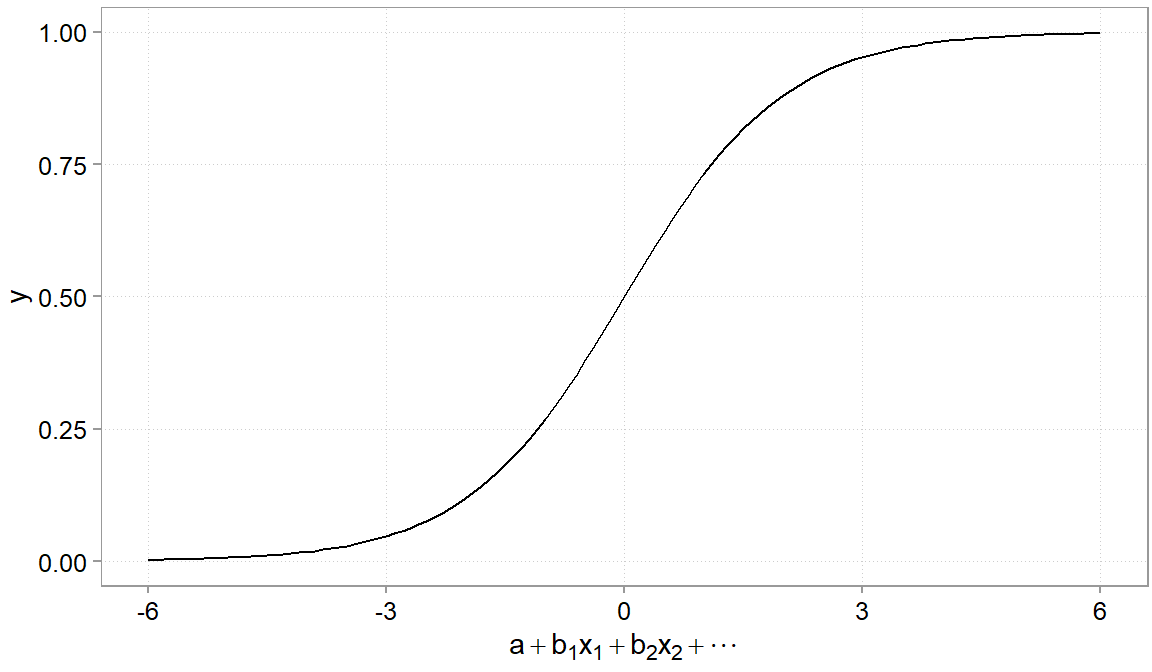
Next to linear regressions, logistic regressions are the next most often used regression tool. It belongs to the family of generalized linear models (GLM). The main differences between these two types of regression lie in the nature of the dependent variable, the function used to model the relationship, and the interpretation of the results. Linear regression is used when the dependent variable is continuous, meaning it can take any real value within a certain range. Logistic regression is specifically designed for binary dependent variables, which have only two categories or outcomes, such as success/failure or yes/no. This is very useful for determinant analysis like: What determined whether a customer did respond to a campaign (a yes/no outcome).
Because the outcome is binary(0, 1), using a normal linear regression could result in predictions that lie far away from the (0; 1) interval. A logistic regression thus needs to ensure that the outcome can never be below 0 and never above 1. It does so by taking a the linear part of the model (the \(a + b_1*x_1 + u\) part) and pushes it through a function (the so-called logistic function) that pulls large values to 1 and too small values to 0. It gives the relation a characteristic S-shaped curve that maps any real-valued input to a value between 0 and 1 (Figure 4.12). Very useful when modeling probabilities.
The only difficulty that the logistic transformation brings about is that it complicates the interpretation of coefficient magnitudes. That is because the S-curve now makes the relation between \(y\) and \(x\) non-linear. In logistic regression, the coefficients are expressed in terms of the logarithm of the odds ratio, which describes the change in the odds of the event occurring for a one-unit change in the independent variable.
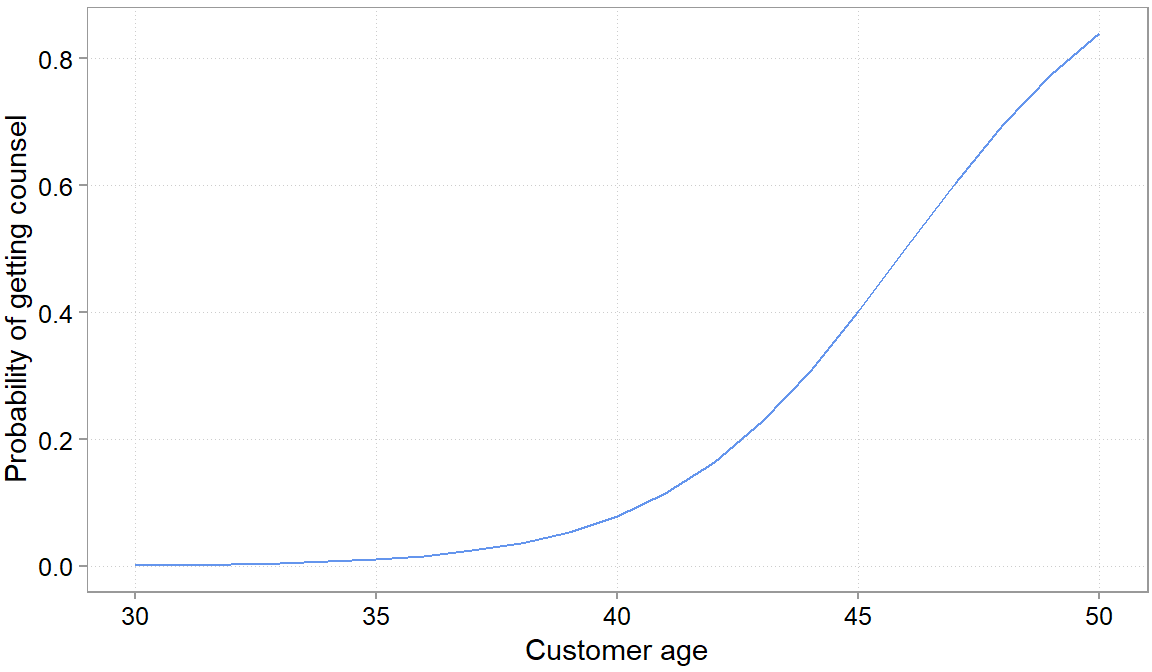
To facilitate interpretation, these coefficients can be exponentiated to obtain the odds ratios, which provide a more intuitive understanding of the relationship between the independent variables and the binary outcome. Let’s consider a hypothetical example to illustrate logistic regression and its interpretation. Assume we are a broker and send an offer around for a counseling on retirement saving. We wanted to know whether older customers were more likely to respond to this campaign. Here is some simulated data and the result of throwing the data into a logistic regression:
set.seed(0374)
# simulating an x variable with 100 random obs ofage between 24 and 58
x = sample(24:58, size = 100, replace = TRUE)
# simulating some probabilities
y = inv_logit(-2 + 0.3 * (x - mean(x)) + rnorm(100, 0, 1.3))
# turning probabilities into a binary 1, 0 variable
y = ifelse(y > 0.5, TRUE, FALSE)
# estimating a model
m5 <- glm(y ~ x, family = binomial(link = "logit"))
summ(m5)
MODEL INFO:
Observations: 100
Dependent Variable: y
Type: Generalized linear model
Family: binomial
Link function: logit
MODEL FIT:
χ²(1) = 86.39, p = 0.00
Pseudo-R² (Cragg-Uhler) = 0.79
Pseudo-R² (McFadden) = 0.66
AIC = 49.40, BIC = 54.61
Standard errors:MLE
-------------------------------------------------
Est. S.E. z val. p
----------------- -------- ------ -------- ------
(Intercept) -18.85 4.42 -4.27 0.00
x 0.41 0.09 4.33 0.00
-------------------------------------------------\[log(odds) = log(p / (1 - p)) = β_0 + β_1 * age\]
where p is the probability of of coming to the counsel meeting, and odds represent the ratio p / (1 - p).
Plugging in the values from our fitted model, we get:
\[log(odds) = -18.85 + 0.41 * age\]
Now, let’s suppose we want to predict the probability of getting counsel for a 40 year old person. We can use the logistic regression equation to calculate the log odds of passing:
\[log(odds) = -18.85 + 0.41 * 40 = -2.45\]
To convert the log odds to a probability, we apply the logistic function:
\[p = 1 / (1 + exp(-log(odds))) = 1 / (1 + exp(2.45)) \sim 0.08\]
So, the probability of passing of a 40 year old responding to the campaign was approximately 8%.
To interpret the coefficients, we can calculate the odds ratio for the independent variable (age) by exponentiating \(\beta_1\):
\[Odds ratio = exp(β1) = exp(0.41) \sim 1.51\]
The odds ratio of 1.51 indicates that for each year of age, the odds of showing up to the counselling increase by a factor of 1.51, holding all other variables constant. You can use the respective functions in your statistical packages to get at these more intuitive numbers.
For presentations it is often easier though to set all variables \(x_2\), \(x_3\) etc to their average values, plug in relevant values for the variable of interest and plot the change in probabilities. We often found this to be the most intuitive way of presenting the non-linear nature of the \(y\) - \(x\) relations in logisitic regressions. As you can see, after a certain age their is a steep increase in the probability of showing up that you would not have expected based on the coefficients.
4.11 Conclusion
The material we covered in this chapter is quite complex and deep. Rather than focusing on the mechanics we tried to focus on important intuition. We still think it is worth, as you get more and more familiar with the tools to dive deeper into it by practicing. Fully understanding these concepts takes practice. With the tools we introduced here, linear and logistic regressions, many applications will be served and if you will already make a large step forward to data-driven decision-making if you have a rudimentary grasp of them. Particularly to find explanations for why you observe certain patterns in your data. For the purpose of creating predictive models, we will continue to discuss regressions and more advanced models in Chapter 5.
As we perform our investigation at the branch level, average employee tenure implies that the tenure of all employees at the respective branch is averaged. Technically, we need to be careful here. As the average tenure is itself estimated, there is additional noise in our x variable that we should account for. We ignore this in the example, for ease of exposition.↩︎
Meaning the test statistic follows a t-distribution. It is computed a slightly differently than, for example, a differences-in-means t-test. The formula is: \(t_r = r√(n-2) / (1-r2)\)↩︎
There is sometimes a trade-off however. If the variables we take out of the error term are highly correlated with our variables of interest, we create a new problem called colinearity.↩︎
We simulated this data and the true coefficient on foot traffic is 210€ in weekly revenues per weekly customer and the true coefficient on staff is 360€ in weekly revenues per staff member.↩︎
Some call this the “table 1 fallacy”.↩︎
There is also a model F-test, but we ignore that. It is rarely useful for model selection.↩︎